Usage
Use a tag to highlight an element on a page to draw attention to it or make it more searchable.
Tag vs. badge
If you need to reflect counts like number of objects, events, or unread items, use a Badge instead.
Variants
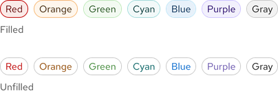
Both variants come in red, orange, green, cyan, blue, purple, and
gray colors. The white variants is for the dark theme only. A filled tag can
be used to add more visual prominence whereas an unfilled tag can be used for
grouping. You can use both variants in the same layout or user interface, just
not in the same area or container. Whatever you choose, be sure to maintain
consistency as best as possible.
Warning
Relying on color alone to communicate information causes barriers to access for many users. Learn more in the Accessibility section.

Icons
Add an icon when additional visual information is helpful or to distinguish tags of the same color.
Helpful tip
Add an icon when additional visual information is helpful or to distinguish tags of the same color.
White tag
The unfilled white tag should be used in the dark theme or on dark backgrounds. It should also be used on its own and not be grouped. The text should not indicate a status, it should be written to be a descriptive caption to elements nearby.

Status
Color
Colors may be used to indicate status if desired. Regardless of what the text says, it is recommended not to use a red tag unless it is communicating a danger or error state.
Helpful tip
Filled tags may communicate a status or message more effectively than unfilled tags because they are more visually prominent.

Text
The text you write can communicate a status as well, so choose a corresponding color that makes sense.

Writing content
Text labels
Text labels should be written to add context or clarity using as few words as possible. If text needs to be longer, use a caption or another text style instead.

The recommended maximum character count for the elements of a tag are listed below and include spaces.
| Element | Character count |
|---|---|
| Text label | 20 |
Grouping
A tag can be used on its own or grouped in a row. When there are too many tags in one row, a new row will appear.

Best practices
Mixing variants
Do not mix variants or tags with and without icons in the same area or container.

Dark theme tags
Do not use light theme tags in the dark theme, contact us if you need dark theme tags.

Custom tags
Do not make your own custom tags. If you need a custom set of tags designed, contact us.

Related elements or patterns
Feedback
To give feedback about anything on this page, contact us.
Red Hat legal and privacy links
- About Red Hat
- Jobs
- Events
- Locations
- Contact Red Hat
- Red Hat Blog
- Diversity, equity, and inclusion
- Cool Stuff Store
- Red Hat Summit
Red Hat legal and privacy links
