
Overview
A button is clickable text or an icon that triggers an action on the page or in the background. Depending on the action, content, and hierarchy, a button can be used on its own or grouped with other buttons.
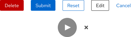
Sample element
Demos
View a live version of this component and see how it can be customized.
<rh-button>Primary</rh-button>

<script type="module">
  import '@rhds/elements/rh-button/rh-button.js';
</script>
<rh-button> demo in a new tabWhen to use
- When you need to allow users to interact with pages in a variety of ways
- When you need to communicate actions users can take
- When you need to draw attention to the highest priority action
Related elements or patterns
Feedback
To give feedback about anything on this page, contact us.
Red Hat legal and privacy links
- About Red Hat
- Jobs
- Events
- Locations
- Contact Red Hat
- Red Hat Blog
- Diversity, equity, and inclusion
- Cool Stuff Store
- Red Hat Summit
Red Hat legal and privacy links

