Keyboard interactions
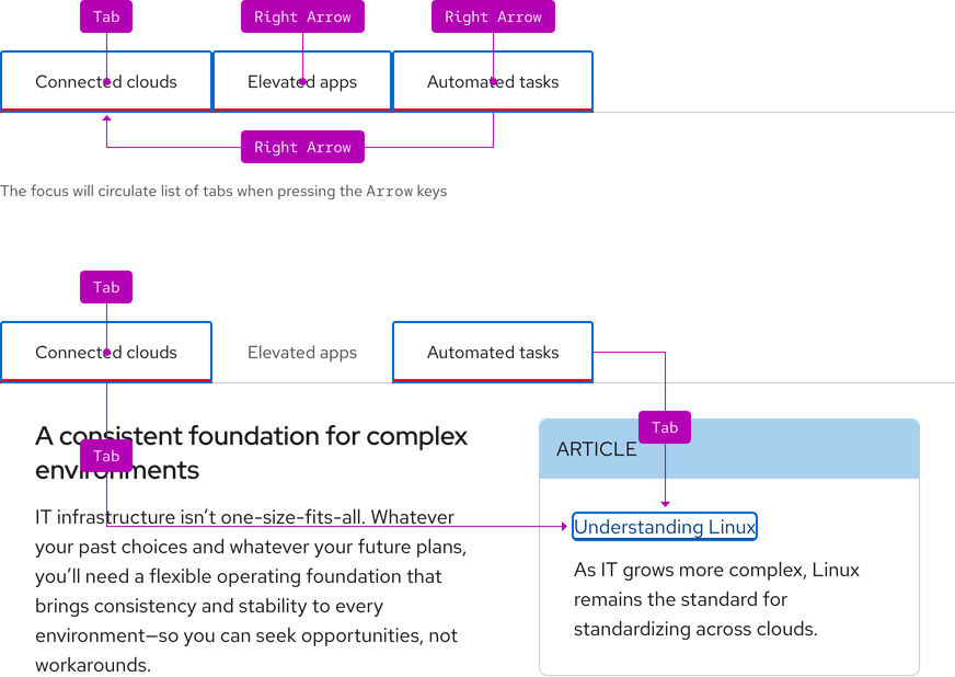
Each tab is a focus stop. Pressing the Arrow keys moves the focus and activates the next or previous tab. Pressing Tab when a tab has focus moves the focus out of the list and onto the next interactive element.
Helpful tip
Overflow buttons do not have focus so there are no keyboard interactions.

| Key | Result |
|---|---|
| Left Arrow | Moves focus to the previous tab and activates it (horizontal tabs) |
| Right Arrow | Moves focus to the next tab and activates it (horizontal tabs) |
| Up Arrow | Moves focus to the previous tab and activates it (vertical tabs) |
| Down Arrow | Moves focus to the next tab and activates it (vertical tabs) |
| Tab | Moves focus to the next tab and activates it (vertical tabs) |
| Shift+Tab | Moves focus from the first interactive element in the panel to the active tab |
Focus order
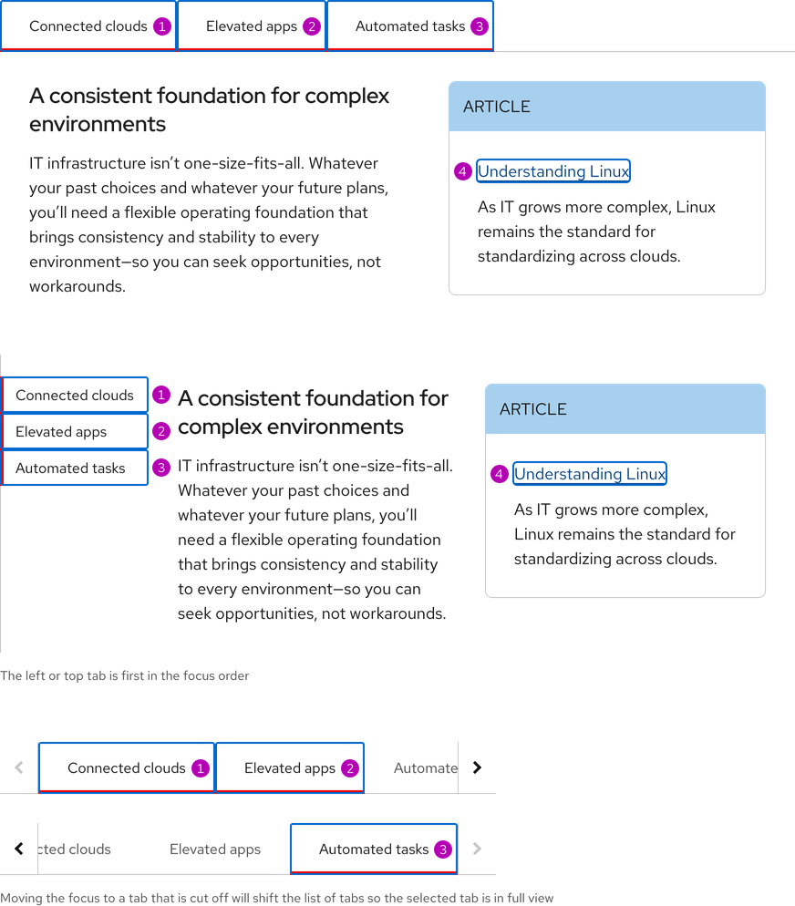
A logical focus order helps keyboard users operate our websites. Elements need to receive focus in an order that preserves meaning, therefore the focus order should make sense and not jump around randomly. For both sizes and orientations, the focus order is from left to right and top to bottom. Disabled buttons are not included in the focus order.

Touch targets
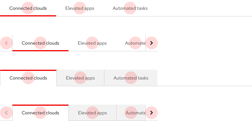
Tabs are adequately spaced for optimal touch targets.

Additional guidelines
- Tabs must communicate to users which tab in the list is currently selected and the total number of tabs available
- There should only be one active tab
- Inactive tabs can inherit hover, focus, and active states
- The active tab can only inherit a focus state
- Each tab must have a unique text label that clearly describes content in the panel
- This is helpful for users of assistive technologies so they have the necessary information to efficiently navigate
- Content authors need to ensure content added to the panel is accessible
- For example, if an image is added to the panel, alternative text needs to be provided to pass testing
ARIA Authoring Practices Guide (APG)
Learn to use the accessibility semantics defined by the Accessible Rich Internet Application (ARIA) specification to create accessible web experiences.
Web Content Accessibility Guidelines
Understanding documents provide detailed explanations for Web Content Accessibility Guidelines (WCAG) guidelines and success criteria.
-
SC 2.1.1 Keyboard (Level A)
-
SC 2.1.3 Keyboard (No exception) (Level AAA)
-
SC 2.4.3 Focus order (Level A)
-
SC 2.5.5 Target size (Level AAA)
Related elements or patterns
Feedback
To give feedback about anything on this page, contact us.
Red Hat legal and privacy links
- About Red Hat
- Jobs
- Events
- Locations
- Contact Red Hat
- Red Hat Blog
- Diversity, equity, and inclusion
- Cool Stuff Store
- Red Hat Summit
Red Hat legal and privacy links
