
Overview
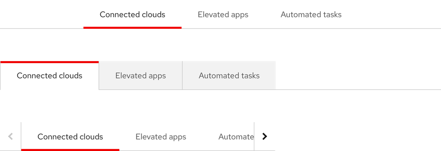
Tabs are used to organize and navigate between sections of content. They feature a horizontal or a vertical list of section text labels with a content panel below or to the right of the component.
Sample element
Demo
<rh-tabs>
  <rh-tab id="users" slot="tab">Users</rh-tab>
  <rh-tab-panel>Users</rh-tab-panel>
  <rh-tab slot="tab">Containers</rh-tab>
  <rh-tab-panel>Containers <a href="#">Focusable element</a></rh-tab-panel>
  <rh-tab slot="tab">Database</rh-tab>
  <rh-tab-panel>Database</rh-tab-panel>
  <rh-tab slot="tab">Servers</rh-tab>
  <rh-tab-panel>Servers</rh-tab-panel>
  <rh-tab slot="tab">Cloud</rh-tab>
  <rh-tab-panel>Cloud</rh-tab-panel>
</rh-tabs>

<script type="module">
  import '@rhds/elements/rh-tabs/rh-tabs.js';
</script>
When to use
- When you need to group related information into different categories
- When users need to read sections of content in the same view without leaving the page
- When you need to group other types of content in the same view like forms, settings, dashboards, etc.
Related elements or patterns
Feedback
To give feedback about anything on this page, contact us.
Red Hat legal and privacy links
- About Red Hat
- Jobs
- Events
- Locations
- Contact Red Hat
- Red Hat Blog
- Diversity, equity, and inclusion
- Cool Stuff Store
- Red Hat Summit
Red Hat legal and privacy links

