Style
Pagination is a horizontal row of square containers that include a control button or page number in the middle. A maximum of seven pages can be displayed before truncation and the appearance of the page input field. The page input field includes a text label, field, and link to the last page. Pagination with truncation must include a page input field so users can access hidden pages.
Anatomy
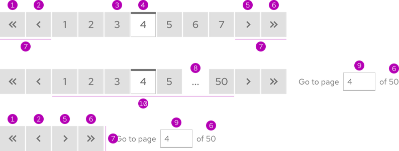
- First page
- Previous page
- Inactive page
- Active page
- Next page
- Last page
- Navigation controls
- Truncation
- Page input field
- Page numbers
Sizes
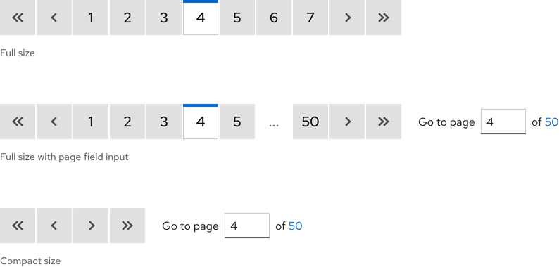
There are two available sizes and the only difference is the Compact size does not display page numbers.
Helpful tip
The Compact size always includes the page input field.
Theme
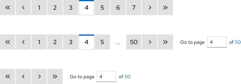
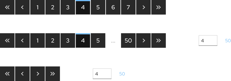
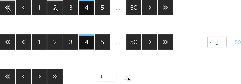
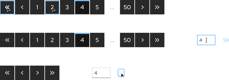
Pagination is available in both light and dark themes.
Light theme
Dark theme
Configuration
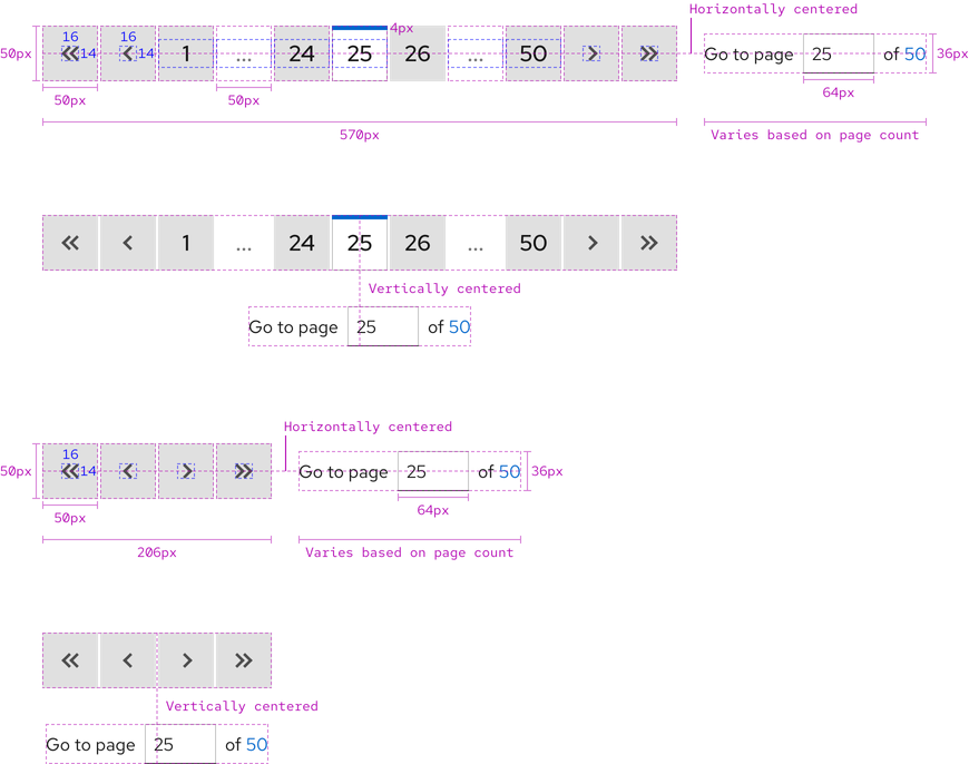
Pagination is a collection of navigation elements including controls, page numbers, and a page input field. The page input field can be horizontally or vertically centered with pagination. The amount and width of square containers is always the same. Each container is 50px x 50px. In Full size pagination, there are 11 squares at 570px combined width and in the Compact size, there are four squares at 206px combined width.
Active page
Styles for the active page are different from inactive pages so users can see their location. Active page styles do not apply to control buttons either because they are not page numbers.
Helpful tip
Active page styles do not apply to the Compact size because there are no page numbers visible.


Space
Space values between elements are the same for both sizes and on all breakpoints.
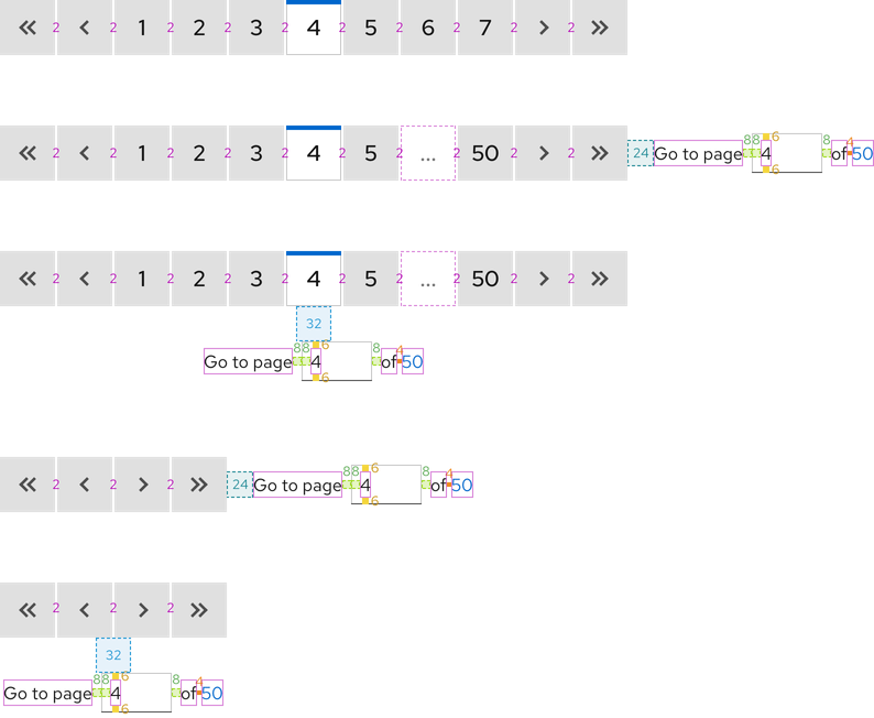
| Example | Token | Description |
|---|---|---|
| 4 | --rh-space-xs | 4px spacer |
| 6 | --rh-space-sm | 6px spacer |
| 8 | --rh-space-md | 8px spacer |
| 24 | --rh-space-xl | 24px spacer |
| 32 | --rh-space-2xl | 32px spacer |
Interaction states
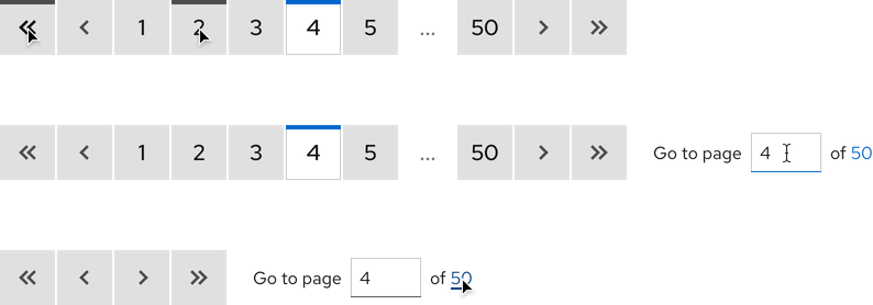
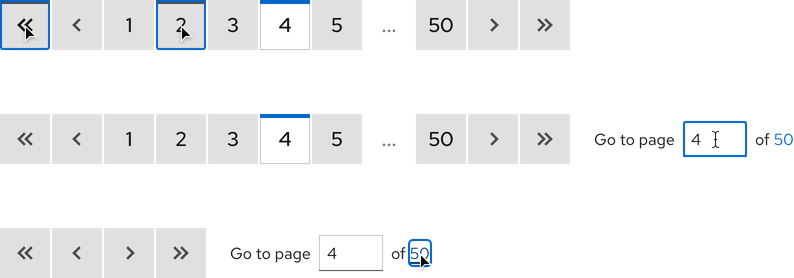
Interactive elements include control and inactive page buttons, the page input field, and last page link.
Hover
Control and inactive page number buttons have the same hover state. Truncation is not interactive so it has no hover state.
Focus


Active
Related elements or patterns
Feedback
To give feedback about anything on this page, contact us.
Red Hat legal and privacy links
- About Red Hat
- Jobs
- Events
- Locations
- Contact Red Hat
- Red Hat Blog
- Diversity, equity, and inclusion
- Cool Stuff Store
- Red Hat Summit
Red Hat legal and privacy links
