
Style
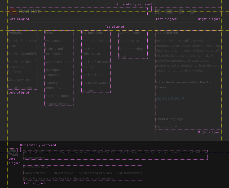
A footer is a stack of two containers that include a variety of elements or content, mostly links and text blocks. Elements in a footer are high in contrast so they grab the attention of users and meet accessibility guidelines. A footer is designed to look similar in style to the primary navigation to ensure a consistent user experience across websites.
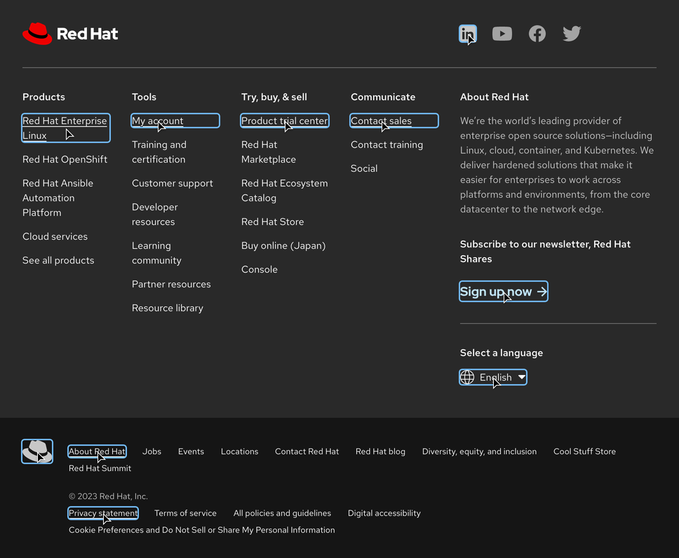
Anatomy
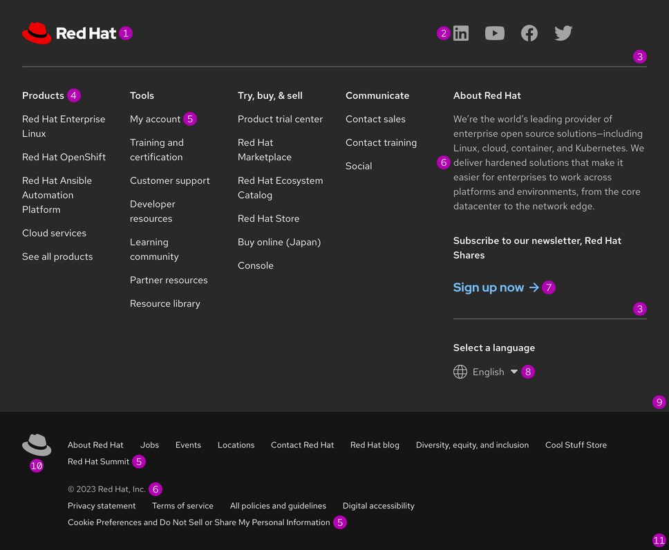
- Website logo
- Social media links
- Divider line
- Navigation title
- Navigation link
- Body text
- Call to action
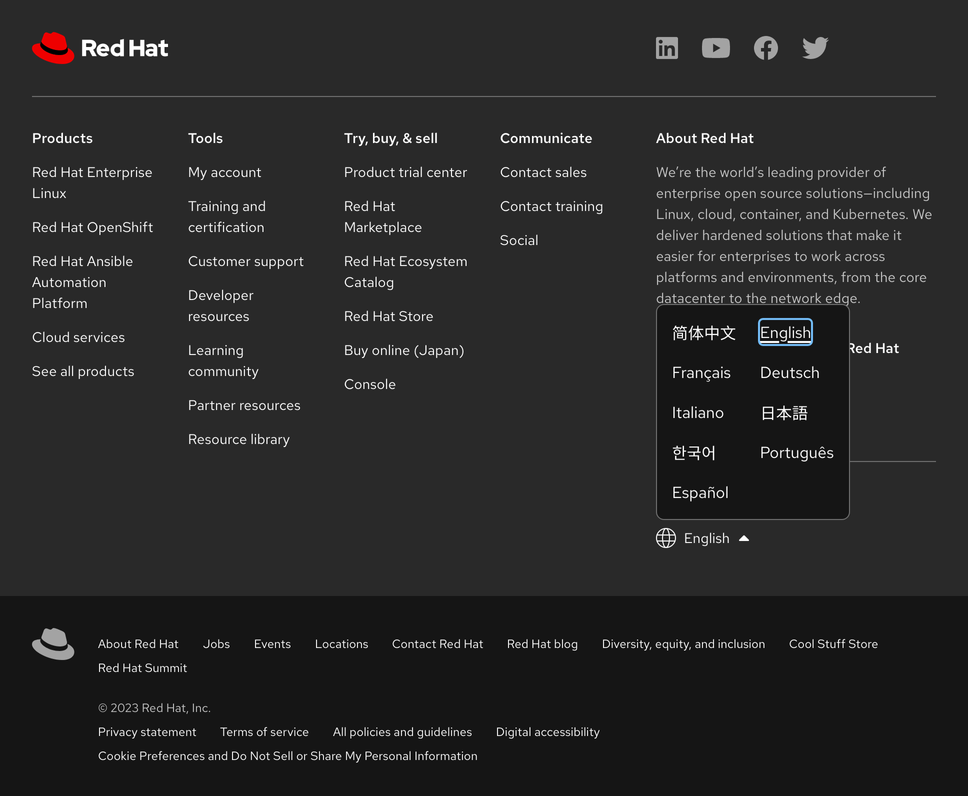
- Language selector
- Website-specific footer
- redhat.com link
- Universal footer
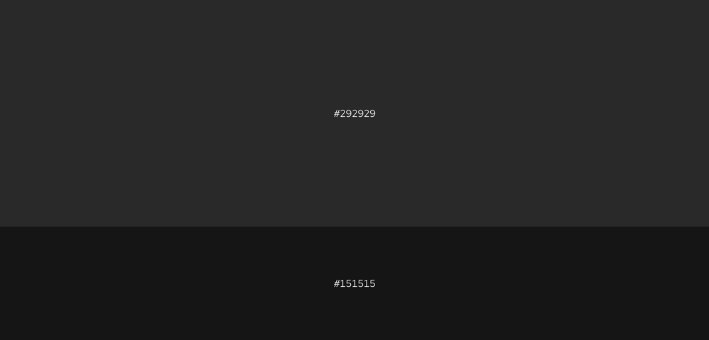
Grays
The website-specific footer background color is a slightly lighter gray than the universal footer background color. This variant creates separation and helps distinguish both footers from each other.
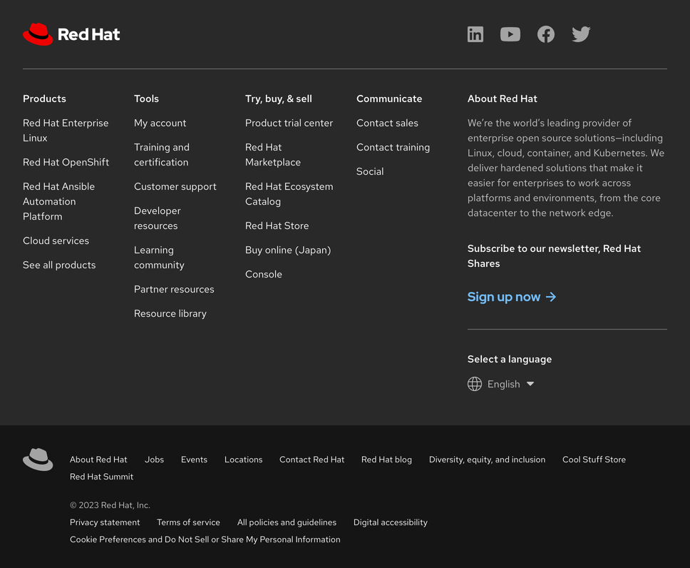
Theme
A footer only has one theme, but visually it could be considered in the dark theme.
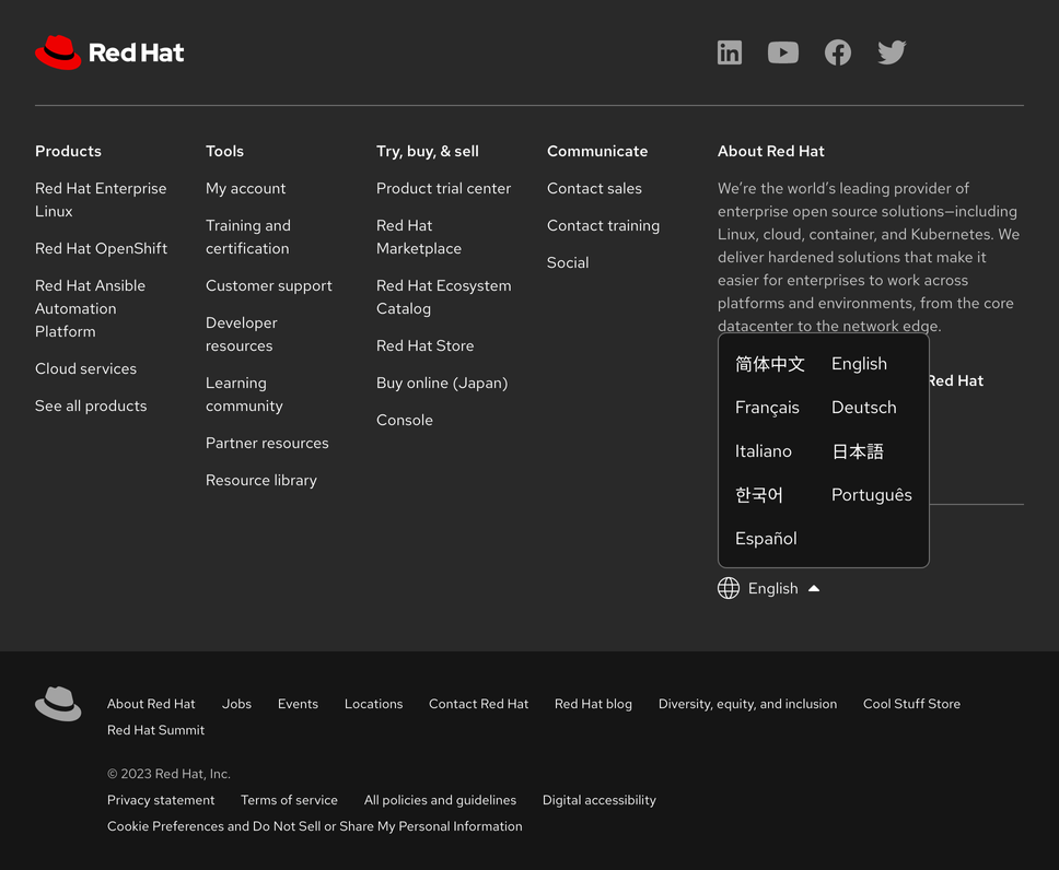
Language selector
Configuration
A footer is a group of regions where various types of content can be organized. Within these regions, position and alignment are somewhat rigid in order to maintain consistency.
Space
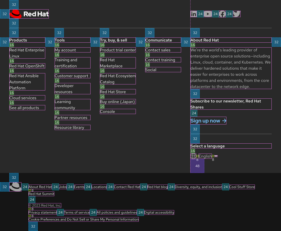
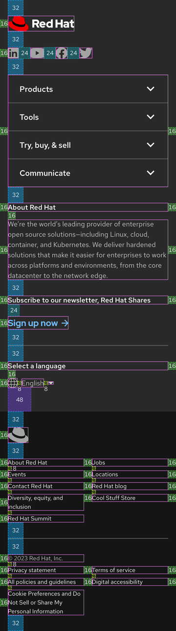
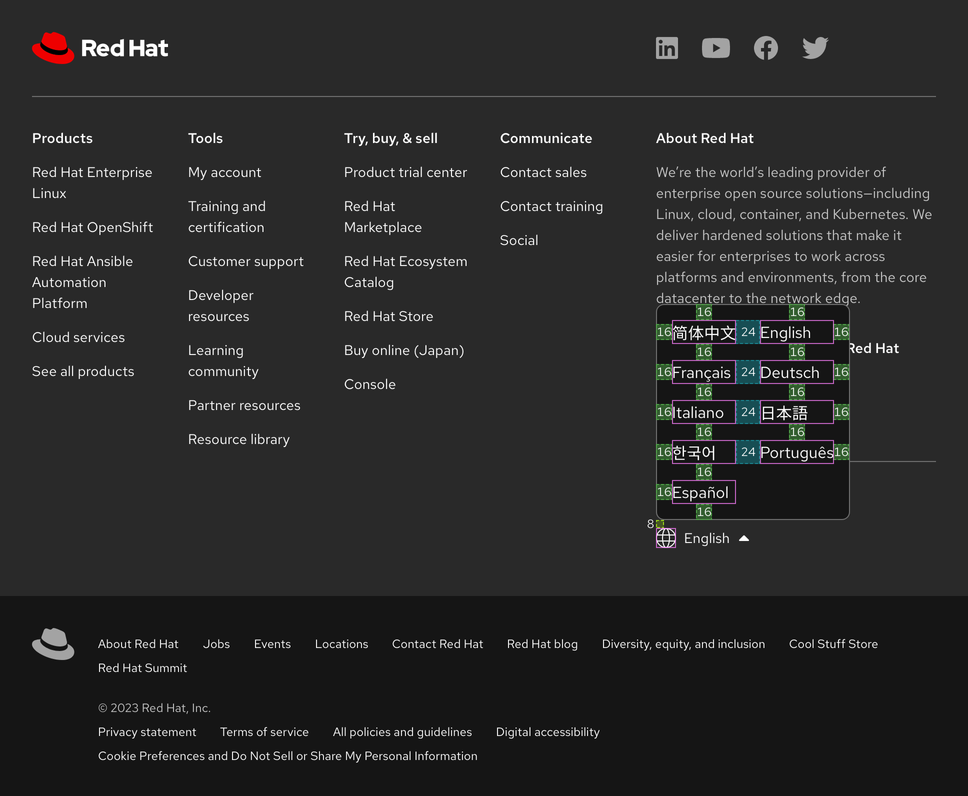
Spacing tokens
| Example | Token | Description |
|---|---|---|
| 8 | --rh-space-md | 8px spacer |
| 16 | --rh-space-lg | 16px spacer |
| 24 | --rh-space-xl | 24px spacer |
| 32 | --rh-space-2xl | 32px spacer |
| 48 | --rh-space-3xl | 48px spacer |
Interaction states
Hover
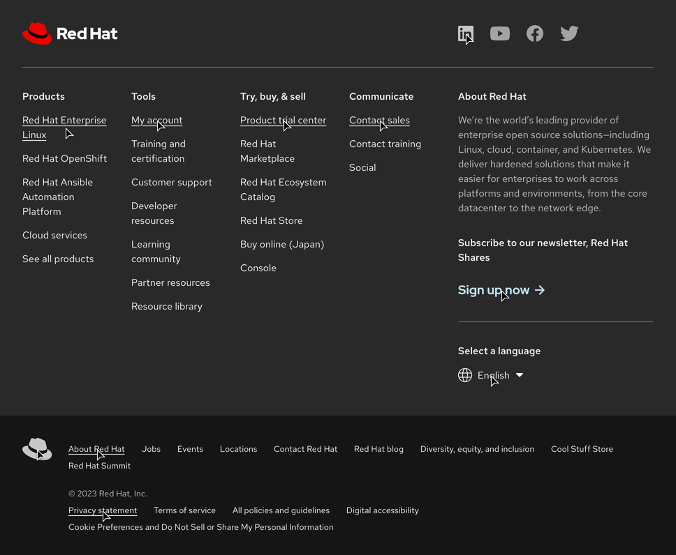
Hover - language selector

Focus
Helpful tip
The Focus state has the same styles as the Hover state.
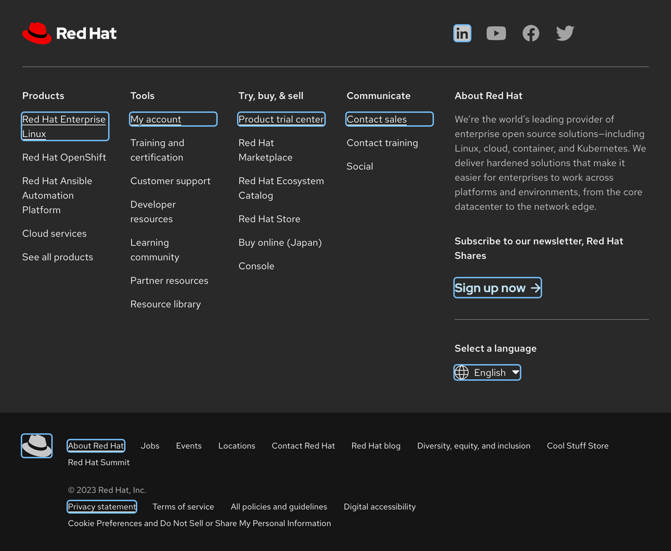
Focus - language selector
Helpful tip
The Focus state has the same styles as the Hover state.
Active
Helpful tip
The Active state has the same styles as the Hover state.
Active - language selector
Helpful tip
The Active state has the same styles as the Hover state.

Related elements or patterns
Feedback
To give feedback about anything on this page, contact us.
Red Hat legal and privacy links
- About Red Hat
- Jobs
- Events
- Locations
- Contact Red Hat
- Red Hat Blog
- Diversity, equity, and inclusion
- Cool Stuff Store
- Red Hat Summit
Red Hat legal and privacy links

