Overview
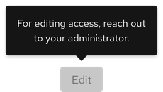
A tooltip is a floating text area that provides helpful or contextual information on hover, focus, or tap.

Sample element
Demos
View a live version of this component and see how it can be customized.
<rh-tooltip>
  <rh-button>Tooltip</rh-button>
  <span slot="content">Lorem ipsum dolor sit amet, consectetur adipiscing elit, sed do eiusmod tempor incididunt ut
    labore et dolore magna aliqua. Mi eget mauris pharetra et ultrices.</span>
</rh-tooltip>

<script type="module">
  import '@rhds/elements/rh-button/rh-button.js';
  import '@rhds/elements/rh-tooltip/rh-tooltip.js';
</script>
<rh-tooltip> demo in a new tabWhen to use
- When users need help making a decision
- When you need to provide more information for icons or icon buttons without labels
- When you need to define new or unfamiliar UI elements that are not described directly in the user interface
Related elements or patterns
Feedback
To give feedback about anything on this page, contact us.
Red Hat legal and privacy links
- About Red Hat
- Jobs
- Events
- Locations
- Contact Red Hat
- Red Hat Blog
- Diversity, equity, and inclusion
- Cool Stuff Store
- Red Hat Summit
Red Hat legal and privacy links
