Usage
Use a footer to provide users with additional supporting content and show them they are using an official Red Hat website. The footer is the last or lowest element in a layout or user interface and is persistently displayed across all screens of the user experience.
Variants
A footer is divided into two parts, the Website-specific footer and the Universal footer.
Website-specific footer
Most of the content in the website-specific footer can be customized.
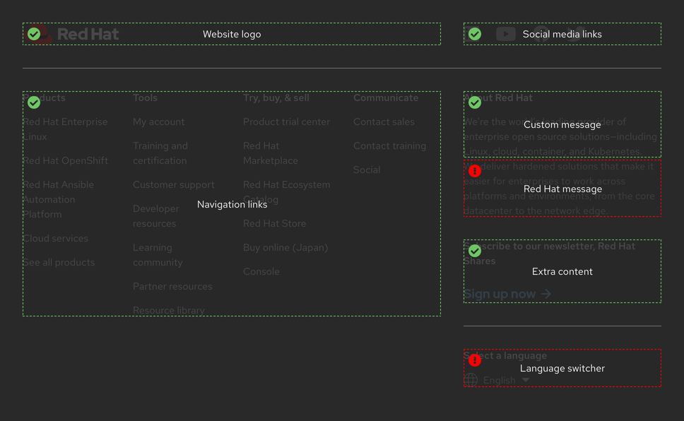
| Region | Customizable | Use case |
|---|---|---|
| Website logo | Yes | Custom logo of the website where the footer is used |
| Social media links | Yes | Links to specific social media pages |
| Navigation links | Yes | Navigation links based on specific information architecture |
| Custom message | Yes | Custom message to introduce or describe the website |
| Red Hat message | No | Message about Red Hat that is the same across all websites |
| Extra content | Yes | Extra content, top task, or call to action (optional) |
| Language switcher | No | Menu that allows users to switch the language |
Universal footer
Content in the universal footer is always the same across all websites.

| Region | Customizable | Use case |
|---|---|---|
| Navigation links | No | Links for global pages, Summit, and legal information |
Layout
Browser window
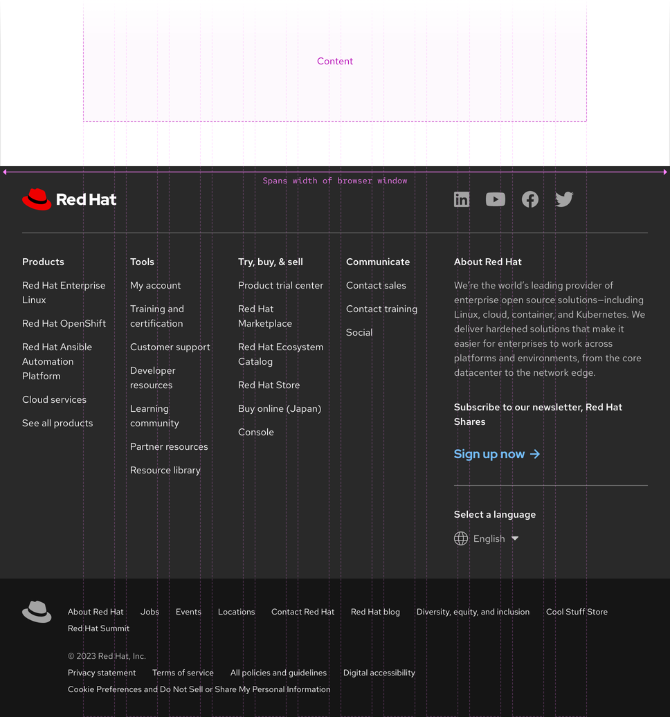
A footer spans the entire width of the browser window at all breakpoints.
Universal footer
The universal footer can be used by itself on orphan pages or pages that do not fit a specific information architecture like landing pages, minisites, etc. The Red Hat fedora always links to redhat.com.
Warning
Using the universal footer by itself is acceptable, but never use the website-specific footer by itself.

Other web properties
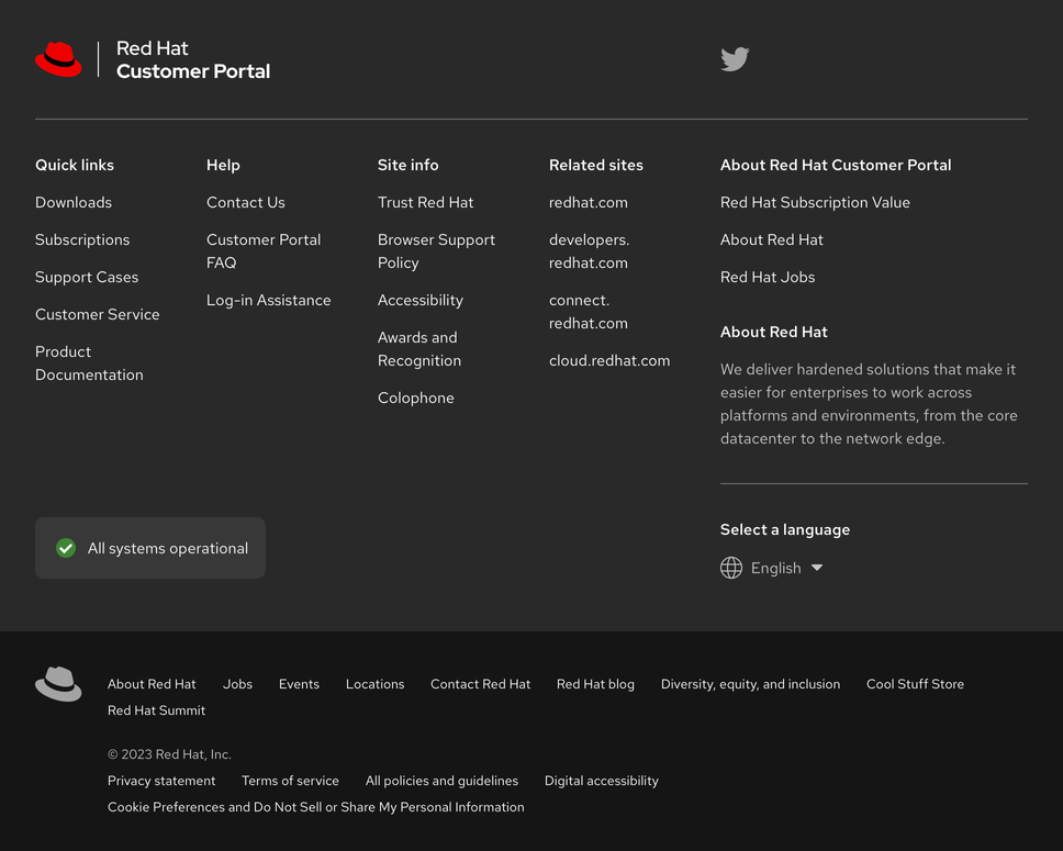
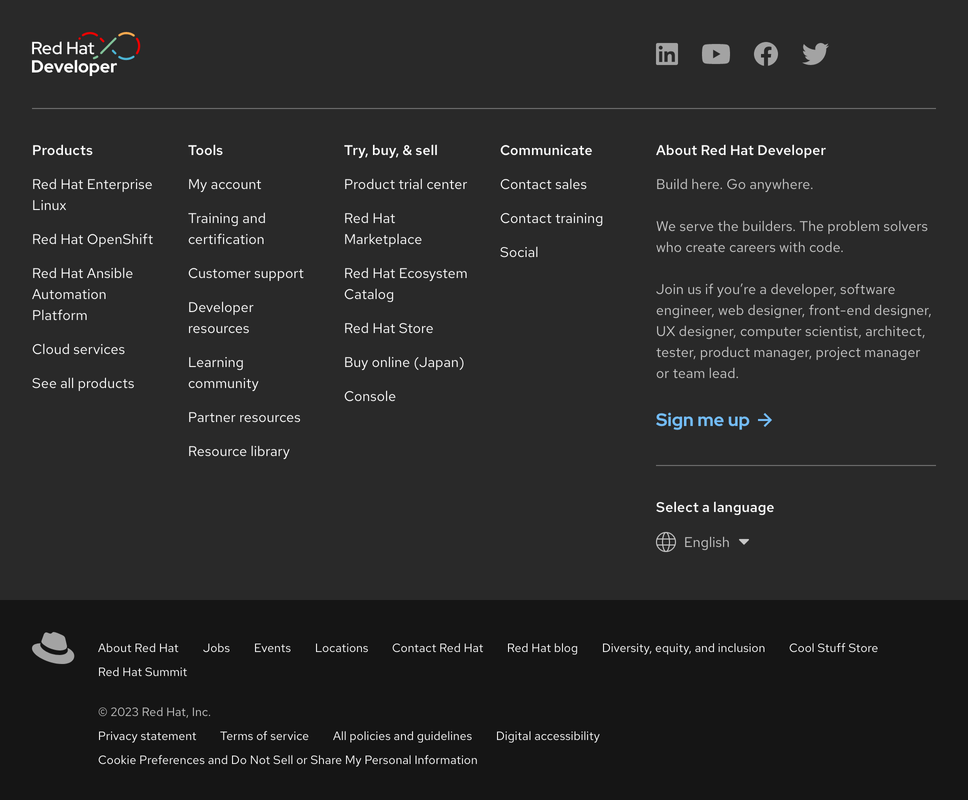
The footer was designed to be applied to all Red Hat web properties. The layout is flexible enough to accommodate grids, elements, text, and more.
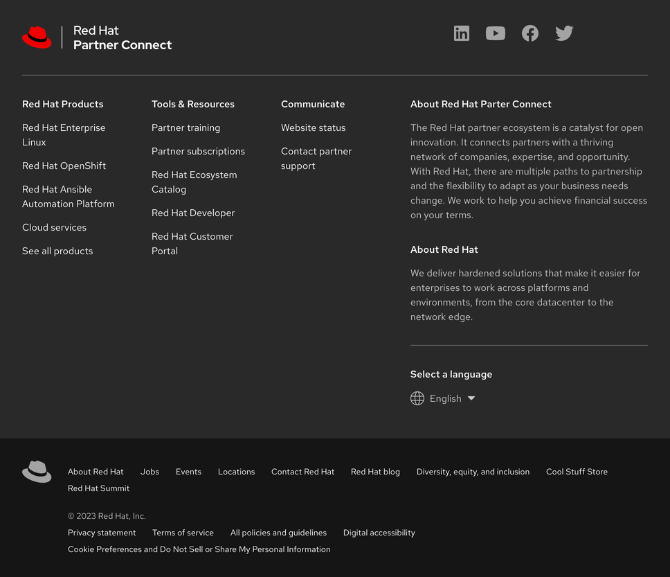
Behavior
Columns
If the website-specific footer includes a lot of content, columns can be added below the first row of columns.
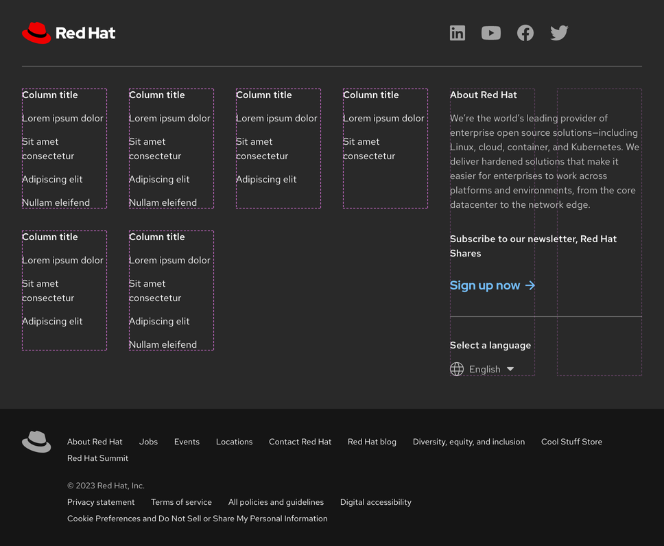
If the website-specific footer includes less content, columns will stretch to fill the empty space.
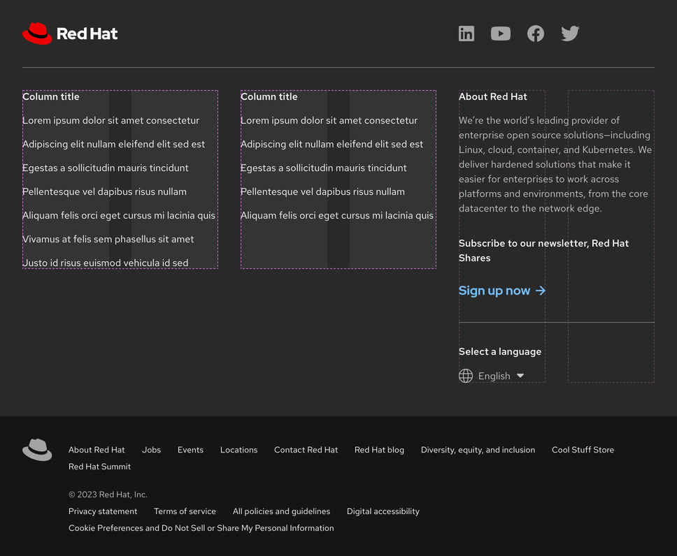
If the number of columns changes, social media links will shift position to remain aligned to the left edge of the last column.
Responsive design
Large breakpoints
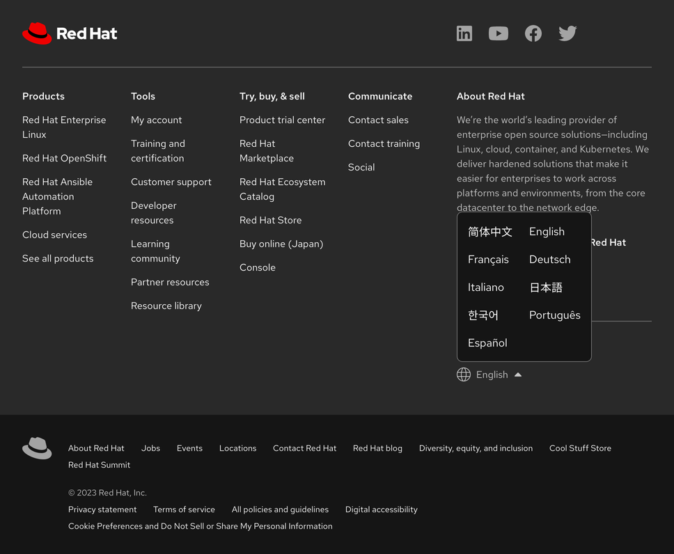
Small breakpoints
Columns will collapse to an accordion as breakpoints get smaller and other content will also get rearranged.
Helpful tip
At small breakpoints, the horizontal rule between the logo, icons, and columns is no longer visible.
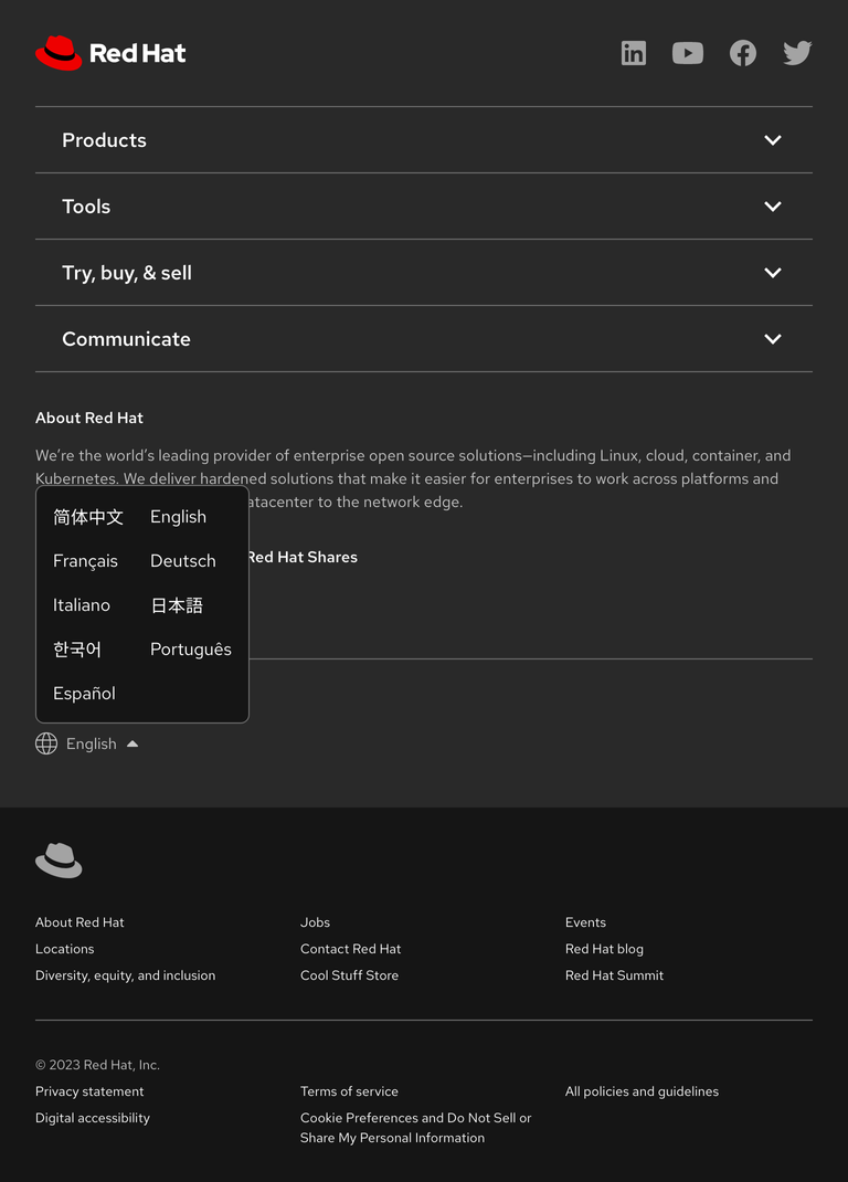

| Breakpoint | Range | Content layout |
|---|---|---|
| Desktop, large | > 1680px | Columns |
| Desktop, medium | 1440px - 1679px | Columns |
| Desktop, small | 1200px - 1439px | Columns |
| Tablet, large | 992px - 1199px | Columns |
| Tablet, small | 768px - 991px | Accordion |
| Mobile, large | 576px - 767px | Accordion |
| Mobile, small | < 575px | Accordion |
Best practices
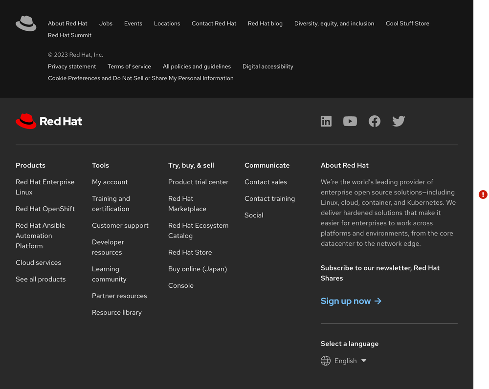
Reversing the order
Do not reverse the order of footers, the website-specific footer should always be on top.
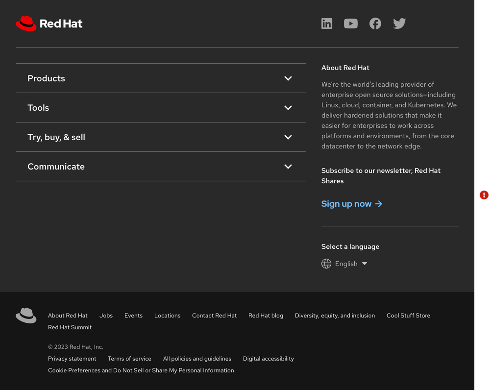
Replacing columns
Do not replace columns with an accordion if there is still adequate space.
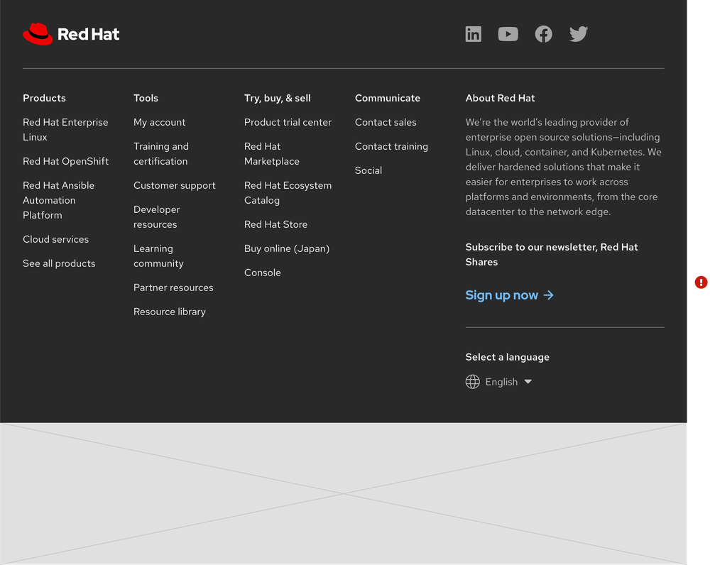
Website-specific footer
Do not use the website-specific footer without the universal footer.
Custom universal footer
Do not create your own custom universal footer by changing, deleting, or rearranging any elements.

Related elements or patterns
Feedback
To give feedback about anything on this page, contact us.
Red Hat legal and privacy links
- About Red Hat
- Jobs
- Events
- Locations
- Contact Red Hat
- Red Hat Blog
- Diversity, equity, and inclusion
- Cool Stuff Store
- Red Hat Summit
Red Hat legal and privacy links
