
Style
A call to action is text in a container or paired with an icon that directs users to new pages. Depending on the link, content, and hierarchy, a call to action can be used on its own or grouped with other calls to action.
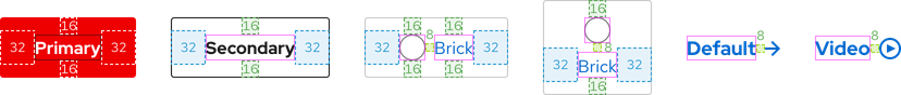
Anatomy
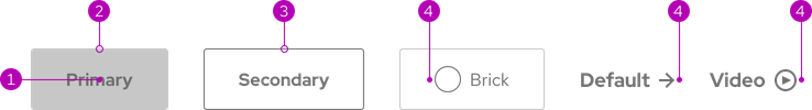
- Text label
- Container
- Border
- Icon
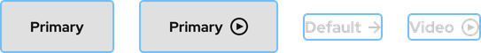
Theme
Calls to action are available in both light and dark themes.
Light and dark themes


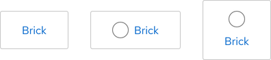
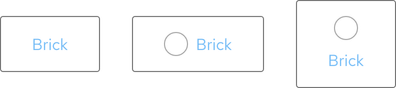
Bricks
The Brick variant includes a slot for an icon as well as an extra orientation.
Video variants
Primary, Secondary, and Default variants include a slot for a video icon. The video icon is the same color as the text label.

White variants
Dark theme includes white variants if other variants are duplicative or if they violate accessibility guidelines.

Configuration
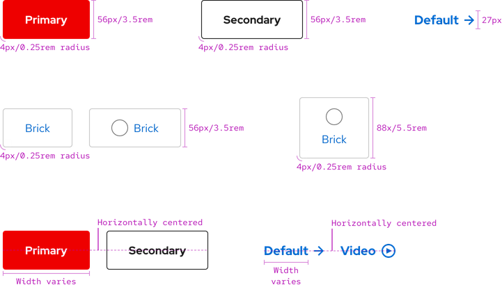
All calls to action with a container have the same border radius, but the height and width vary based on the presence of icons and the amount of content. Calls to action in a row are horizontally centered.
Space
Space values are the same on all breakpoints for calls to action. To see space values when calls to action are grouped, go to the Guidelines page.
| Example | Token | Description |
|---|---|---|
| 8 | --rh-space-md | 8px spacer |
| 16 | --rh-space-lg | 16px spacer |
| 24 | --rh-space-xl | 24px spacer |
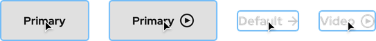
Interaction states
Interaction states are visual representations used to communicate the status of an element or pattern.
Hover


Focus
Helpful tip
The Focus state has the same styles as the Hover state.


Active
Helpful tip
The Active state has the same styles as the Hover state.


Related elements or patterns
Feedback
To give feedback about anything on this page, contact us.
Red Hat legal and privacy links
- About Red Hat
- Jobs
- Events
- Locations
- Contact Red Hat
- Red Hat Blog
- Diversity, equity, and inclusion
- Cool Stuff Store
- Red Hat Summit
Red Hat legal and privacy links

