Keyboard interactions
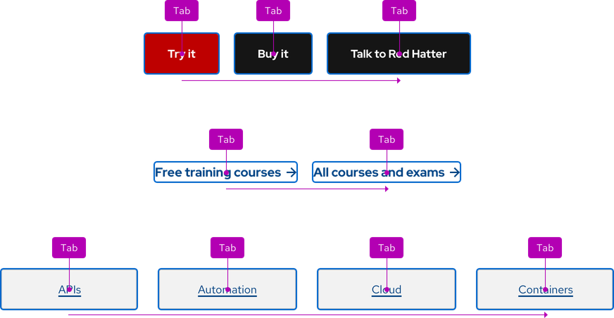
Users should have the ability to navigate to and interact with calls to action using their keyboard.

| Key | Result |
|---|---|
| Tab | Moves focus to the next call to action or interactive element |
| Shift+Tab | Moves focus to the previous call to action or interactive element |
| Enter | Activates a link |
| Enter | Hides or reveals a panel below a Brick variant |
Focus order
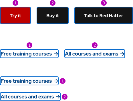
A logical focus order helps keyboard users operate our websites. Elements need to receive focus in an order that preserves meaning, therefore the focus order should make sense and not jump around randomly. For grouped calls to action, the focus order is from left to right and top to bottom.

Touch targets
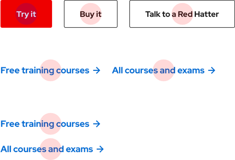
Grouped calls to action are adequately spaced for optimal touch targets.

Screen reader guidelines
Calls to action should communicate the following to users:
- Their intended purpose or function
- The toggle state when a panel is hidden or visible
- An instruction that a panel will open
ARIA Authoring Practices Guide (APG)
Learn to use the accessibility semantics defined by the Accessible Rich Internet Application (ARIA) specification to create accessible web experiences.
Web Content Accessibility Guidelines
Understanding documents provide detailed explanations for Web Content Accessibility Guidelines (WCAG) guidelines and success criteria.
- SC 2.1.1 Keyboard (Level A)
- SC 2.1.3 Keyboard (No exception) (Level AAA)
- SC 2.4.3 Focus order (Level A)
- SC 2.5.5 Target size (Level AAA)
Related elements or patterns
Feedback
To give feedback about anything on this page, contact us.
Red Hat legal and privacy links
- About Red Hat
- Jobs
- Events
- Locations
- Contact Red Hat
- Red Hat Blog
- Diversity, equity, and inclusion
- Cool Stuff Store
- Red Hat Summit
Red Hat legal and privacy links
