Overview
Introduction
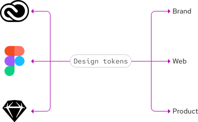
Design tokens are the source of truth of our design decisions. They are also the values needed to maintain our design system, including color, space, typography, etc. Designers, developers, engineers, etc. use tokens instead of hard-coded values to create flexible yet seamless user experiences across a variety of platforms and technologies. Design tokens will soon be directly integrated into all of our websites, libraries, and tools.

Installation
To install design tokens, please visit our dedicated repo for instructions.
Token categories
We want your feedback on our tokens. Contact us if there are missing values or if you have an idea for an output format or tool integration.
Types of tokens
-
Global tokens
Global tokens represent the foundations of our design language and should have context-agnostic names. These can be used and are inherited by other token types.
-
Semantic tokens
Semantic tokens represent context or abstraction. They communicate the purpose of a token and are effective when a value with a single intent is used multiple times.
-
Element tokens
Element tokens link semantic tokens to specific elements. They are prefixed with the element name and ship in the
@rhds/elementspackage, rather than@rhds/tokens.
Why we need tokens
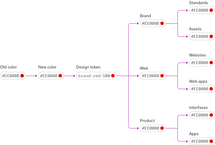
In addition to being the source of truth of our design decisions, design tokens
help us track system-wide changes. When we make an update, that change will
propagate consistently across all of our experiences. For example, if we update
a color to be more accessible, or a font size to be more legible, these changes
will propagate to every page which uses the updated @rhds/tokens package.
Design tokens can also bring teams together under common practices. For example, designers, developers, engineers, etc. can all use the same tokens and work toward consistency even if a token is updated.

Tokens and our design system
We are working toward a platform-agnostic and shareable resource for our collective design decisions. Our goal is to enable users to download, customize, and apply tokens to their designs and code without keeping track of so many websites, libraries, and tools.

Naming tokens
Design tokens are names based on how they are used. For example,
--rh-color-surface-lightest is used as a background colour in light color
contexts. A clear and predictable name ensures that attributes are displayed
correctly and any actions are communicated clearly. Tokens should be named by
proceeding from the general to the specific, e.g. colour (general), surface
(more specific), lightest (most specific).

Aliases
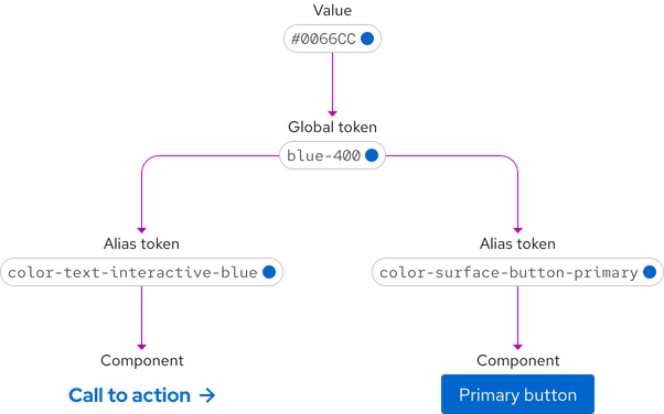
Some of our design tokens leverage an additional layer of abstraction called aliases. Alias tokens point to a global token which holds their value.
We use aliases to help systematize the desired values referenced by our tokens. One benefit of this approach is that by using alias tokens, users can reference semantic aliases instead of hard-coded values. Another benefit is that it enables flexibility. If we need to update an alias and want those changes applied across the design system, we only need to change that single alias in order for it to propagate everywhere.

Themes
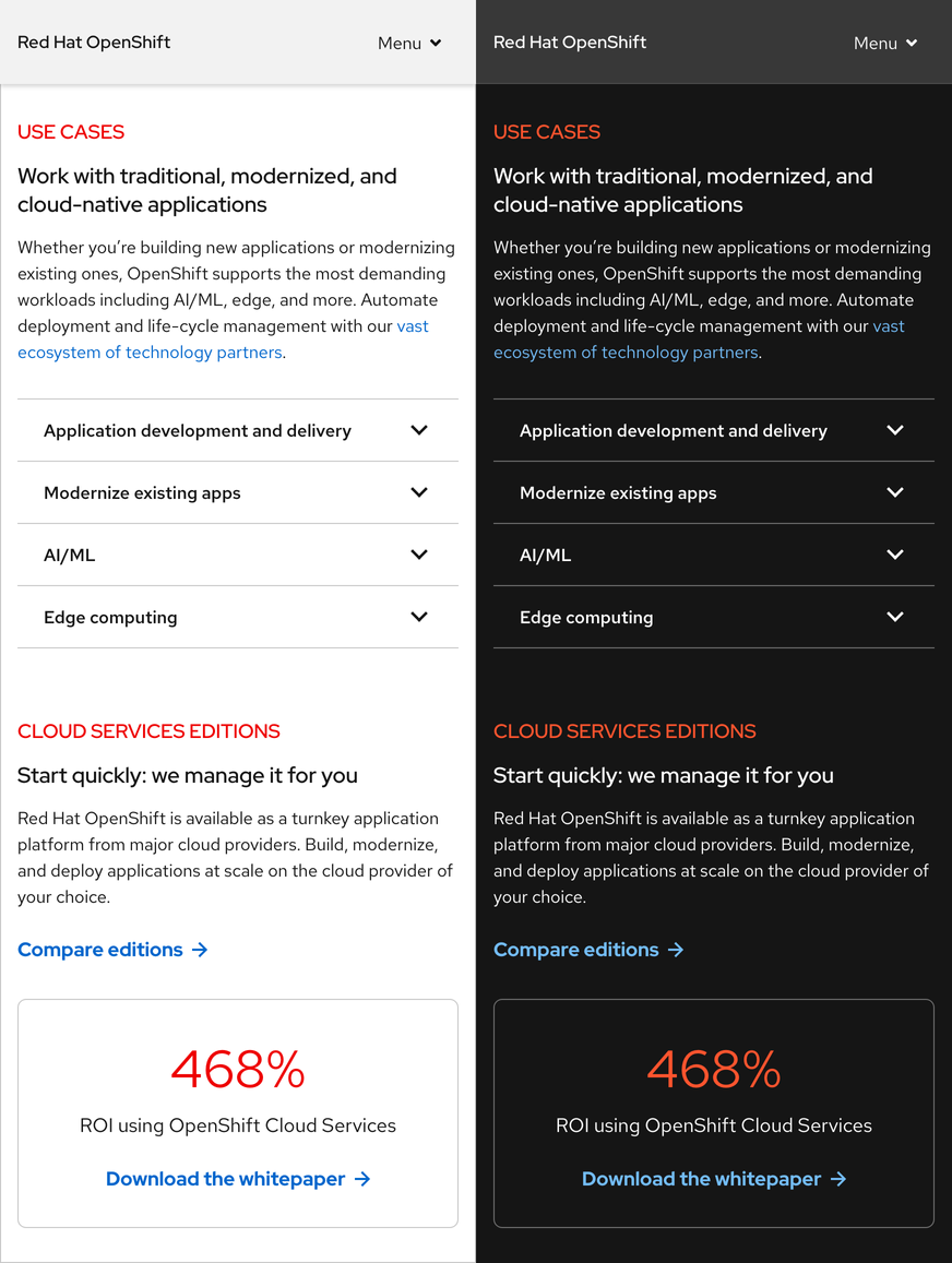
Themes are collections of design tokens that reference specific values. These values change when a user switches themes. Using themes enables us to ship one design system while serving multiple design languages that need to meet different audience or brand requirements.

Other libraries
To learn more about our other libraries, visit this page.
Feedback
To give feedback about anything on this page, contact us.
Red Hat legal and privacy links
- About Red Hat
- Jobs
- Events
- Locations
- Contact Red Hat
- Red Hat Blog
- Diversity, equity, and inclusion
- Cool Stuff Store
- Red Hat Summit
Red Hat legal and privacy links
