Disclosure
Overview
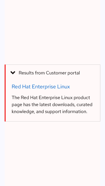
A Disclosure toggles the visibility of sections of content. It features one panel that consists of a caret icon and a section text label that collapses or expands to reveal more information.
Sample pattern
Results from Customer Portal
Amet dolor deserunt consectetur enim. Amet irure esse est minim sint eu aliquip officia nulla dolore proident. Voluptate dolore nisi aute ut amet quis elit. Id voluptate et ipsum commodo aute do. Eu excepteur sunt ex nostrud sit cillum eu excepteur aliqua fugiat. Tempor ad exercitation amet ad tempor esse.
Aliqua aliqua do fugiat incididunt voluptate eiusmod. Pariatur laborum aliquip cupidatat esse amet. Velit fugiat irure amet enim proident labore qui eu excepteur. Sit tempor officia ex nisi dolor. Culpa exercitation ad aliquip duis mollit ipsum.
Style
A disclosure can be used in light and dark themes. It consists of one panel that features a border around the entire container when collapsed and expanded. The panel contains a text label for the section and a caret icon that rotates to indicate if a panel is collapsed or expanded. When the panel is expanded, it includes different styling that consists of an active border on the left and a slight drop shadow, similar to an Accordion.
Theme
Usage
A disclosure is used for storing supplementary content in a contained space, like extra search results. It enables a user to collapse or expand information as needed on the current page.
A disclosure is great for hiding extra information that’s not a crucial part of the user experience, it’s also beneficial because it reduces page scrolling. Consider whether a disclosure should be used. If content is crucial or requires more focus to read, don’t use a disclosure.
Usage vs. Accordion
A disclosure only has one section panel. If more than one panel is needed, use an accordion instead. A disclosure is used to store supplementary content that might not be a crucial part of the user experience whereas accordions are used to organize more important information.
A disclosure features slightly different styles than accordions. A disclosure has the caret icon positioned on the left before the section text label whereas accordions have the caret icon placed on the right after the section text label.
Label formatting
Section text labels should be written concisely and be representative of the content within. Be mindful of lengthy character counts and how they’ll impact the appearance of a disclosure, especially on smaller screens or if they’re translated.
Content area
When the panel is expanded, it contains a content area under the caret icon and section text label. It may contain the same elements that can also be used in other sections of a page, like text, cards, images, etc. To maintain optimal readability, text shouldn’t exceed eight grid columns.
Character count
The label should have fewer characters to help users make sense of what the content will be when they expand a content area.
| Element | Character count |
|---|---|
| Label | 65 |
Jump links
On small screens, vertical Jump links can be wrapped in a disclosure and act as persistent navigation.
Best practices
A disclosure consists of one panel only. If more than one panel is needed, use an accordion instead.
Text inside the panel shouldn’t exceed eight grid columns to maintain optimal readability.
Don’t wrap other complex components inside of a disclosure unless absolutely necessary, like jump links.
Behavior
States
A disclosure can be collapsed and expanded to hide or reveal information when toggled. By default, it loads with its panel collapsed (this can be customized), allowing users to get a quick preview of the content inside.
Collapsing and expanding
The disclosure panel can be collapsed or expanded by clicking on or tapping the caret icon, the section text label, or anywhere inside the container. When the panel is collapsed, the caret icon points to the right toward the text. When the panel expands, the caret icon rotates 90º and points down, revealing the content inside.
Tab order
When the Tab key is pressed, the focus indicator highlights the collapsed disclosure. When a user expands the panel by pressing the Enter or Space keys, any interactive elements inside are added to the tab order before the focus indicator moves away to the next section of content.
Responsive design
A disclosure works well when used on both large and small screens.
Breakpoints
Disclosures can be used on smaller screens, but the limited screen space makes content taller which might make users scroll more, so be careful about how much content is included.
Desktop
Tablet
Mobile

Interaction states
The interaction states in the collapsed state are the same as the expanded state.
Officia eu id pariatur enim exercitation ipsum laboris irure reprehenderit
Amet dolor deserunt consectetur enim. Amet irure esse est minim sint eu aliquip officia nulla dolore proident. Voluptate dolore nisi aute ut amet quis elit. Id voluptate et ipsum commodo aute do. Eu excepteur sunt ex nostrud sit cillum eu excepteur aliqua fugiat. Tempor ad exercitation amet ad tempor esse.
Aliqua aliqua do fugiat incididunt voluptate eiusmod. Pariatur laborum aliquip cupidatat esse amet. Velit fugiat irure amet enim proident labore qui eu excepteur. Sit tempor officia ex nisi dolor. Culpa exercitation ad aliquip duis mollit ipsum.
Spacing
The announcement banner uses space tokens to define spacing values between elements.
| Example | Token | Description |
|---|---|---|
| 6 | --rh-space-sm | 6px spacer |
| 16 | --rh-space-lg | 16px spacer |
| 24 | --rh-space-xl | 24px spacer |
| 48 | --rh-space-3xl | 48px spacer |
Related elements or patterns
Feedback
To give feedback about anything on this page, contact us.
