Approach
At our core, we believe in creating interactions and experiences that are inclusive. This means ensuring that all Red Hat digital properties are accessible to everyone.
Using color alone
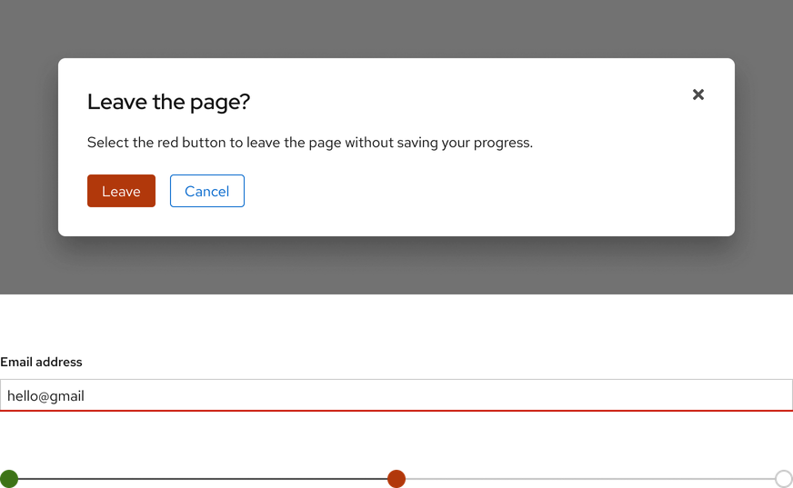
When considering methods of communication or feedback, do not use color (or location) alone. Ensure there is a text label, icon, underline, or other visual cue to communicate meaning. Consider how the following elements would look to a color blind user.

Contrast
We strive to adhere to WCAG 2.1 AA requirements. Our text, links, interface elements, etc. are designed with sufficient contrast when used on top of a canvas, surfaces, image backgrounds with low contrast, and near adjacent colors.
Text
Small foreground text (non-bold text under 24px and bold text under 19px) must have a contrast ratio of 4.5:1 and large foreground text (non-bold text of at least 24px and bold text of at least 19px) must have a contrast ratio of 3:1.

Links
If color is the only way to distinguish between links and surrounding text (e.g., if link underlines are removed), the contrast ratio between the link and surrounding text must be at least 3:1.
- Non-color cues must be used to signify when the link receives hover or focus (e.g., an underline)

Graphical objects and UI components
Graphical objects and UI components should have a contrast ratio of at least 3:1 (e.g., within charts and infographics). If color is the only way to distinguish between inline controls and their surrounding text, the contrast ratio between the control and text must be at least 3:1.
- Non-color cues (e.g., a border) must be used to signify when the element receives focus
Layering
It is acceptable to layer colors with the same hue, saturation, or lightness on white, black, or gray. However, layering them near or on top of each other might cause vibration. If you need to layer colors, follow WCAG 2.1 AA requirements.

Tools
TPGi’s Colour Contrast Analyzer can help you identify colors and gauge their contrast from one another.
Foundations
To learn how to use our other foundations in your designs, visit the foundations section.
Feedback
To give feedback about anything on this page, contact us.
