Style
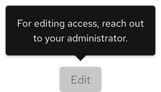
A tooltip is a container with text that includes an arrow and sometimes a drop shadow. It can be anchored to various elements like buttons, icons, etc.
Anatomy

- Container
- Text
- Arrow
- Trigger
Theme
A tooltip is available in both light and dark themes. The dark theme tooltip container does not include a drop shadow.
Light theme

Dark theme

Configuration
All badges have the same height and border radius.

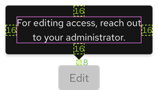
Space

| Example | Token | Description |
|---|---|---|
| 8 | --rh-space-md | 8px spacer |
| 16 | --rh-space-lg | 16px spacer |
Animation
A tooltip has a 300ms entry delay on hover by default, but this can be customized. For example, if you would like it to appear immediately, set the delay to 0ms.
Interaction states
A tooltip appears near an icon or element on hover, focus, or when tapped. A tooltip contains only text and is not interactive.

Related elements or patterns
Feedback
To give feedback about anything on this page, contact us.
Red Hat legal and privacy links
- About Red Hat
- Jobs
- Events
- Locations
- Contact Red Hat
- Red Hat Blog
- Diversity, equity, and inclusion
- Cool Stuff Store
- Red Hat Summit
Red Hat legal and privacy links
