
Usage
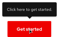
Use a tooltip as a way for users to see more information before they select an element, go to a new page, or trigger an action on the page.
Tooltip vs. popover
A tooltip and Popover provide more information in context for users. However, they are different in the following ways.
- A tooltip is used for simple communication purposes while a popover is more descriptive
- Content in a tooltip is generally shorter while content in a popover can be longer and include a heading, images, or links
- A tooltip is triggered on hover (or a tap on mobile devices) while a popover is triggered by a click
Content
Content in a tooltip is limited to text only. Consider the following when writing tooltip content.
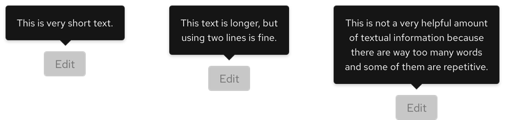
Character count
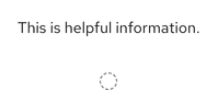
A tooltip's body text should be short and descriptive.
| Element | Character count |
|---|---|
| Body | 60 |
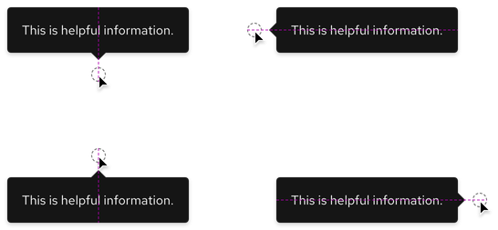
Orientation
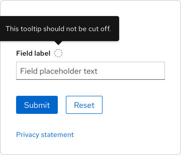
The correct orientation of a tooltip depends on the amount of content and browser window. If a tooltip covers up important information or gets cut off, choose a different orientation.
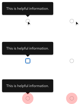
Behavior
When a cursor or focus is moved, the tooltip disappears. On mobile devices, users must tap to trigger a tooltip and then tap again to make it disappear.
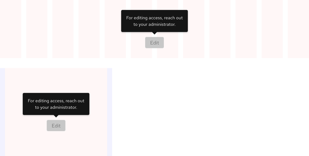
Responsive design
A tooltip can generally be used on both large and small breakpoints if the content is not too long.
Best practices
White on white
Do not use a dark theme tooltip in light theme environments.
Cut off by browser window
A tooltip should not be cut off by the browser window. Change the orientation if it does.
Unnecessary pairing
Do not add a tooltip to interface elements or actions that do not require further explanation.
Related elements or patterns
Feedback
To give feedback about anything on this page, contact us.
Red Hat legal and privacy links
- About Red Hat
- Jobs
- Events
- Locations
- Contact Red Hat
- Red Hat Blog
- Diversity, equity, and inclusion
- Cool Stuff Store
- Red Hat Summit
Red Hat legal and privacy links

