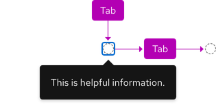
Keyboard interactions
A tooltip will appear when the trigger receives focus and disappear when moving focus away from the trigger.

| Key | Result |
|---|---|
| Tab | Moves focus to the trigger, tooltip appear |
| Tab | Moves focus away from the trigger, tooltip disappears |
| Esc | Removes a tooltip without moving focus away from the trigger |
Additional guidelines
- Do not use a tooltip on static elements
- A tooltip should persist while hovering over the trigger and tooltip
- A tooltip should persist as long as the trigger has focus
- Users navigating via screen reader must have tooltip text announced to them when it is triggered
- If a tooltip is added to a disabled trigger, that trigger must be able to receive focus
ARIA Authoring Practices Guide (APG)
Learn to use the accessibility semantics defined by the Accessible Rich Internet Application (ARIA) specification to create accessible web experiences.
Web Content Accessibility Guidelines
Understanding documents provide detailed explanations for Web Content Accessibility Guidelines (WCAG) guidelines and success criteria.
- SC 2.1.1 Keyboard (Level A)
- SC 2.1.3 Keyboard (No exception) (Level AAA)
- SC 2.4.3 Focus order (Level A)
- SC 2.5.5 Target size (Level AAA)
Related elements or patterns
Feedback
To give feedback about anything on this page, contact us.
Red Hat legal and privacy links
- About Red Hat
- Jobs
- Events
- Locations
- Contact Red Hat
- Red Hat Blog
- Diversity, equity, and inclusion
- Cool Stuff Store
- Red Hat Summit
Red Hat legal and privacy links
