
Style
A secondary navigation is a group of links and menus placed in a bar container that spans the width of the browser window.
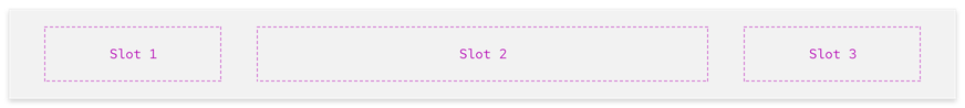
Anatomy
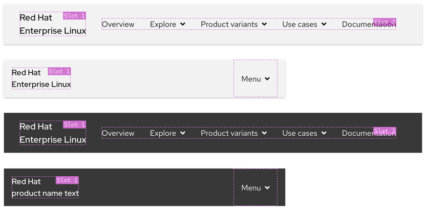
A secondary navigation is divided into three slots, it is not required to use all three slots.
- Slot 1 - includes primary elements like product logo text
- Slot 2 - includes secondary elements like links and menus
- Slot 3 - includes tertiary elements like a call to action (optional)
Using slots
Slots are defined areas where content can be inserted, each slot includes a specific type of content.
| Slot number | Use case |
|---|---|
| Slot 1 | Includes a linked logo or text that directs users to a main page or home page |
| Slot 2 | Includes navigation elements like inline links, menus, and external links |
| Slot 3 | May include interactive elements like a call to action |
Slots and breakpoints
On small breakpoints, navigation elements in Slot 2 will collapse into an accordion within a menu. Optional elements in Slot 3 will be placed below the accordion or hidden completely.
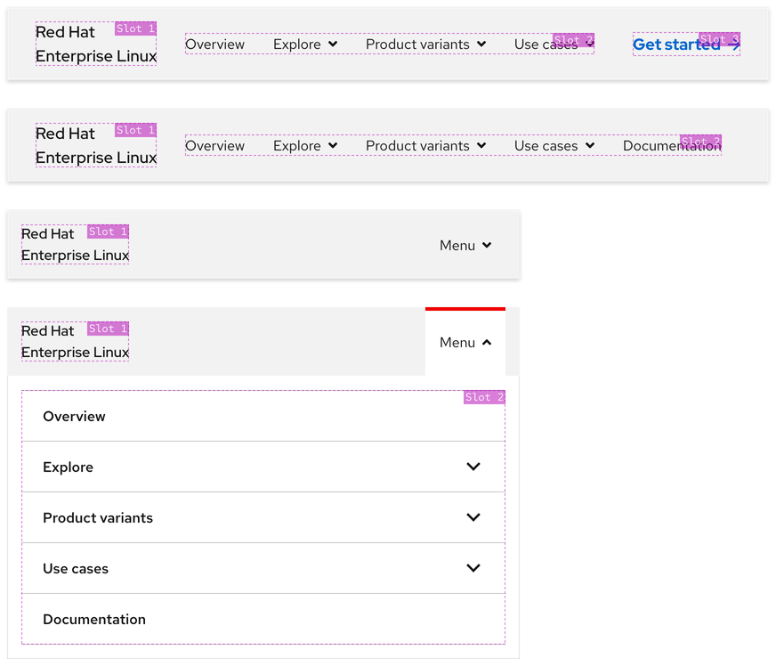
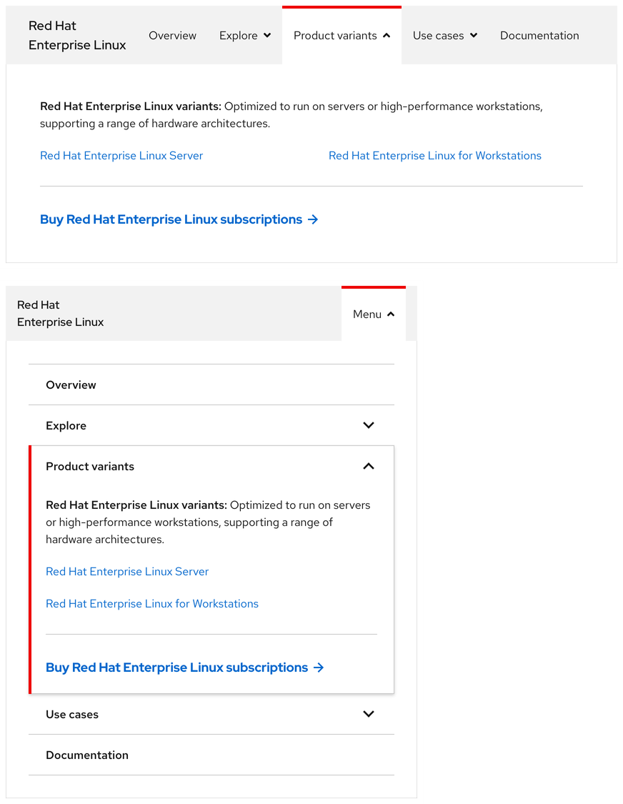
Using the expandable menu
The expandable menu is an area where content can be placed like text, links, calls to action, and more. The menu requires a backdrop so it can separate itself from the page underneath, this helps users focus on the menu content.
Theme
A secondary navigation is available in both light and dark themes. The light theme background includes a box shadow whereas the dark theme background includes a gray bottom border.
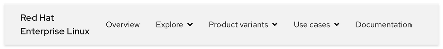
Light theme
The light theme secondary navigation should be used in environments with a lighter look and feel. The box shadow is always visible unless covered by an expanded menu.
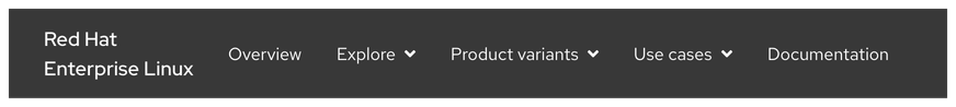
Dark theme
The dark theme secondary navigation should be used in environments with a darker look and feel. The gray bottom border is always visible unless covered by an expanded menu.
Configuration
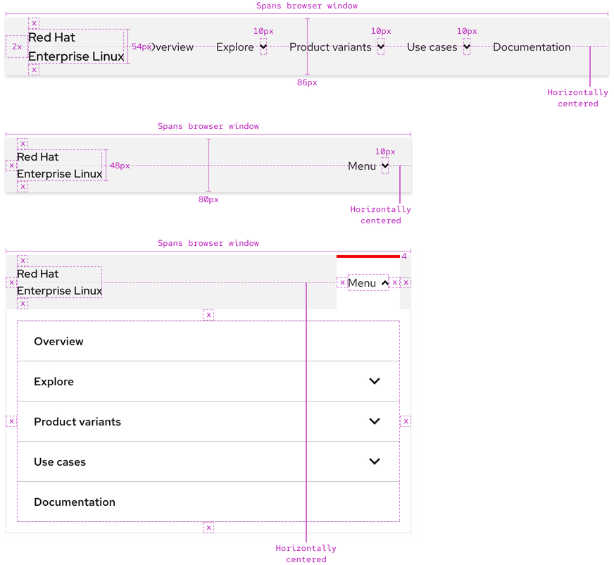
A secondary navigation spans the entire width of a browser window on all breakpoints. It has a fixed height of 86px on large breakpoints and a fixed height of 80px on small breakpoints even if Slot 1 text is only one line. Content in all slots is horizontally centered with the background.
Expandable menu styles
An expandable menu includes content like text, links, calls to action, and more. The menu tab, panel, and backdrop have the same styles on all breakpoints.
Slot text labels
Slot 1 and Slot 2 text elements have specific styles applied to them.
Helpful Tip
Slot 3 usually includes a Call to action. To see Call to action styles, visit the Call to action page.
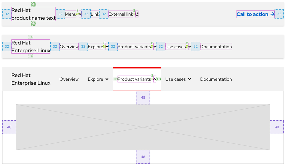
Space
The amount of space in a secondary navigation remains about the same on all breakpoints.
Large breakpoints
Small breakpoints
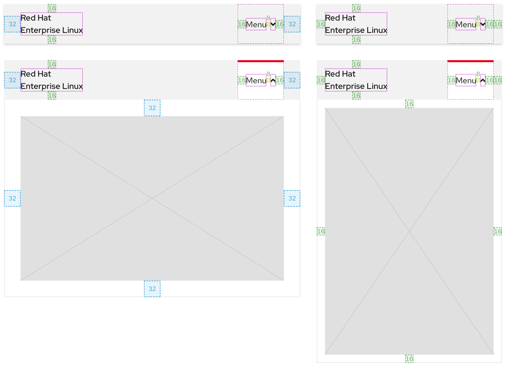
| Example | Token | Description |
|---|---|---|
| 8 | --rh-space-md | 8px spacer |
| 16 | --rh-space-lg | 16px spacer |
| 32 | --rh-space-2xl | 32px spacer |
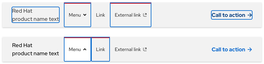
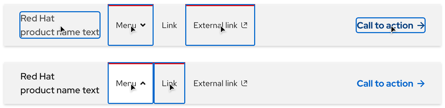
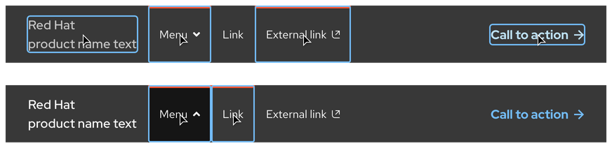
Interaction states
Interaction states are visual representations used to communicate the status of an element or pattern.
Hover
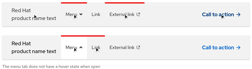
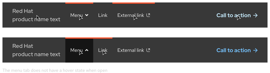
Focus
Helpful Tip
The Focus state has the same styles as the Hover state.
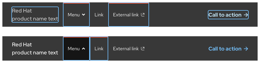
Active
Helpful Tip
The Active state has the same styles as the Hover state.
Related elements or patterns
Feedback
To give feedback about anything on this page, contact us.
Red Hat legal and privacy links
- About Red Hat
- Jobs
- Events
- Locations
- Contact Red Hat
- Red Hat Blog
- Diversity, equity, and inclusion
- Cool Stuff Store
- Red Hat Summit
Red Hat legal and privacy links

