
Style
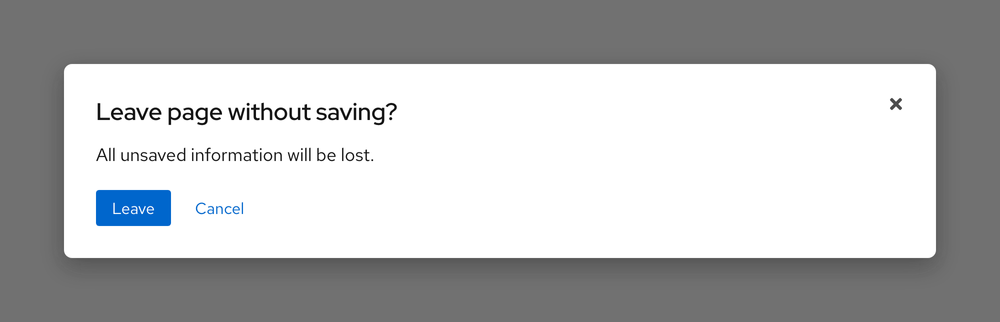
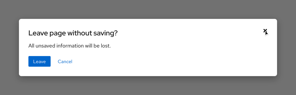
A dialog is a floating container on top of a transparent backdrop. The container requires a backdrop so it can separate itself from the page underneath, this helps users focus on the dialog content.
Anatomy
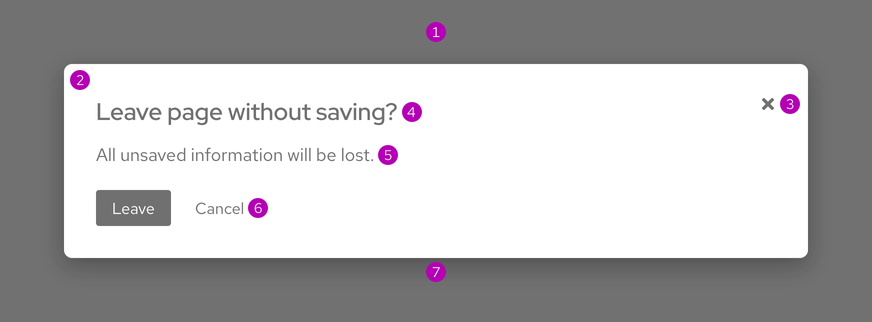
- Backdrop
- Container
- Close button
- Header section
- Body text section
- Footer section
- Container shadow
Theme
A dialog is available in the light theme only.
Configuration
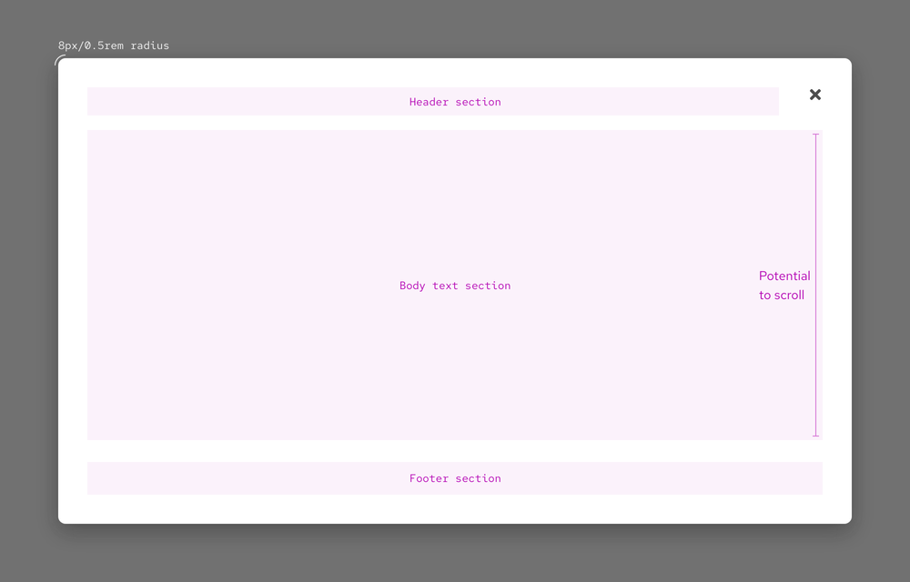
The dialog container does not have a maximum height, but too much content in the body text section will cause scrolling.
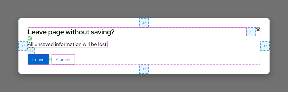
Space
The amount of space in a dialog reduces as breakpoints get smaller.
Large breakpoints
Small breakpoints
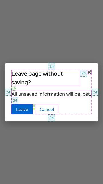
| Example | Token | Description |
|---|---|---|
| 8 | --rh-space-md | 8px spacer |
| 16 | --rh-space-lg | 16px spacer |
| 24 | --rh-space-xl | 24px spacer |
| 32 | --rh-space-2xl | 32px spacer |
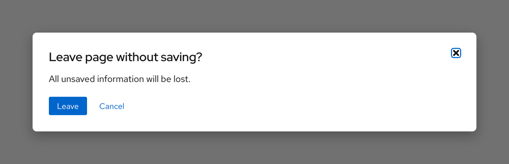
Interaction states
Interactive elements may be added to a dialog container, but very sparingly. If interactive elements are added, go to their element or pattern pages to view the interaction states.
Hover
Control and inactive page number buttons have the same hover state. Truncation is not interactive so it has no hover state.
Focus
Active

Related elements or patterns
Feedback
To give feedback about anything on this page, contact us.
Red Hat legal and privacy links
- About Red Hat
- Jobs
- Events
- Locations
- Contact Red Hat
- Red Hat Blog
- Diversity, equity, and inclusion
- Cool Stuff Store
- Red Hat Summit
Red Hat legal and privacy links

