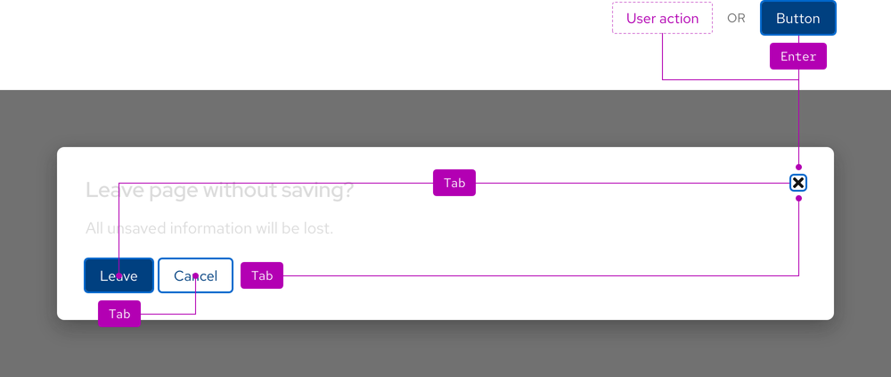
Keyboard interaction
A dialog can be opened by pressing Enter when the dialog trigger has focus. When a dialog is open, moving focus using a keyboard is constrained or trapped within the dialog container. Keyboard navigation by pressing Tab will cycle focus through the interactive elements until the dialog is closed.

| Key | Result |
|---|---|
| Tab | Moves focus to the next interactive element in the cycle |
| Enter | Activates an interactive element or a button |
| Esc | Dismisses a dialog |
Focus order
When a dialog opens, the element that should receive focus depends on the content and size of the modal. To help you decide where to place focus, follow these guidelines:
- If the dialog contains semantic elements like lists or tables that are necessary to perceive in order to better understand dialog content, place focus on a static element at the start of the content
- The element that receives focus in this way must have
tabindex=“-1”
- The element that receives focus in this way must have
- If the dialog includes an irreversible action like deleting data, place focus on the least destructive action
- If the dialog includes actions that simply provide additional information like
OKorContinuebuttons, place focus on the action that is likely to be most frequently used - If none of the above apply, place focus on the first focusable element
- If placing focus on an element causes the beginning of dialog content to scroll out of view, place focus on a static element at the top instead
- The element that receives focus in this way must have
tabindex=“-1”
- The element that receives focus in this way must have
Touch targets
Only the close button and any interactive elements are selectable.

Backdrop
A dialog will not close by users clicking or tapping the backdrop or outside of the container.
Additional guidelines
- Content outside of a dialog cannot be interacted with or navigated to while the dialog is open
- The
Escapekey should close the dialog - There should be at least one clickable button that closes the dialog
- Long dialog content can still receive focus via keyboard if it overflows and a scrollbar appears
- When a dialog closes, focus should return to the last focused item before the dialog was opened
ARIA Authoring Practices Guide (APG)
Learn to use the accessibility semantics defined by the Accessible Rich Internet Application (ARIA) specification to create accessible web experiences.
Web Content Accessibility Guidelines
Understanding documents provide detailed explanations for Web Content Accessibility Guidelines (WCAG) guidelines and success criteria.
- SC 2.1.1 Keyboard (Level A)
- SC 2.1.3 Keyboard (No exception) (Level AAA)
- SC 2.4.3 Focus order (Level A)
- SC 2.5.5 Target size (Level AAA)
Related elements or patterns
Feedback
To give feedback about anything on this page, contact us.
Red Hat legal and privacy links
- About Red Hat
- Jobs
- Events
- Locations
- Contact Red Hat
- Red Hat Blog
- Diversity, equity, and inclusion
- Cool Stuff Store
- Red Hat Summit
Red Hat legal and privacy links
