Style
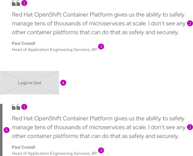
A blockquote is a combination of elements used to give visual prominence to a quotation. By default, a blockquote includes a quote icon, quotation text, and citation text at a minimum. A blockquote may also include the following optional elements:
- Emphasis border
- Logo
- Title and heading text
- Interactive elements or layouts like a video or card

- Quote icon
- Quotation text
- Citation text
- Logo or text placeholder
- Emphasis border
Sizes

Theme
A blockquote is available in both light and dark themes.
Light theme

Dark theme

Emphasis border


Title and heading text


Configuration
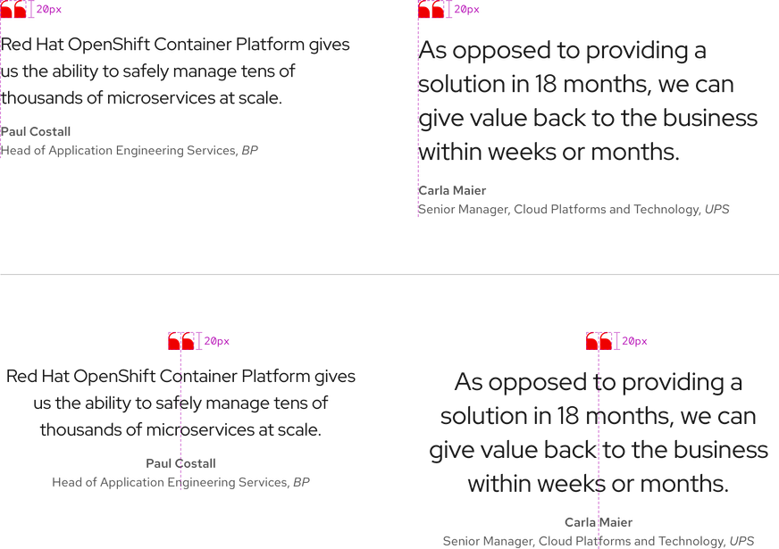
The base elements in both sizes are stacked and left aligned by default, but they can be vertically centered if necessary.

Order
A blockquote was designed to be read from top to bottom. If certain optional elements are included, the order will change.

- Logo or text (always ordered first if included)
- Quotate icon (always included and ordered first if there is no logo or text)
- Quotation text (always ordered after the quote icon)
- Citation text (always ordered last)
Citation text
Citation text has specific styles applied to it.

Space
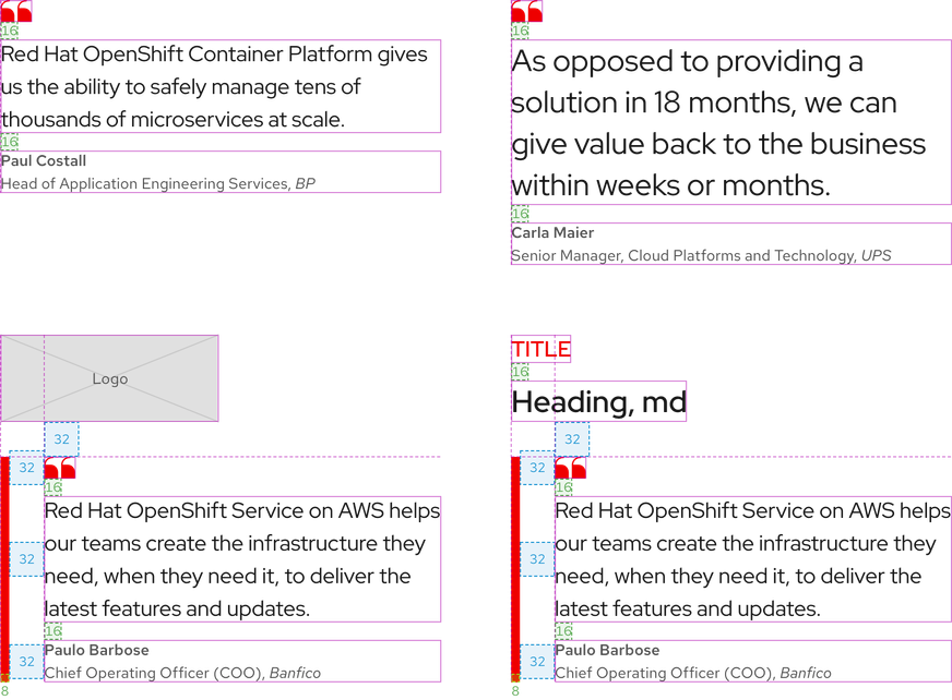
Space values are the same in both sizes and on all breakpoints.

| Example | Token | Description |
|---|---|---|
| 8 | --rh-space-md | 8px spacer |
| 16 | --rh-space-lg | 16px spacer |
| 32 | --rh-space-2xl | 32px spacer |
Interaction states
A blockquote includes text only and is not interactive unless interactive elements are added like a video or other elements within a card. If interactive elements are added, go to their element or pattern pages to view the interaction states.
Related elements or patterns
Feedback
To give feedback about anything on this page, contact us.
Red Hat legal and privacy links
- About Red Hat
- Jobs
- Events
- Locations
- Contact Red Hat
- Red Hat Blog
- Diversity, equity, and inclusion
- Cool Stuff Store
- Red Hat Summit
Red Hat legal and privacy links
