Usage
Use a blockquote to highlight quotation and citation text so users can identify them easier. A blockquote has a flexible layout and it includes a variety of optional elements, so use it strategically because there is a balance between using some and too many blockquotes. A blockquote should have adequate padding around it to avoid competing with other content or elements.
Sizes
Use the Default size for larger amounts of text and the Large size for smaller amounts of text.

Alignment
Both blockquote sizes can be left or center aligned.
Warning
Centered text is sometimes hard to read, so avoid setting a lot of text in the center alignment.

Variations
A variety of extras including an emphasis border, logo, and text styles may be added to a blockquote.
Light theme


Dark theme


Other elements
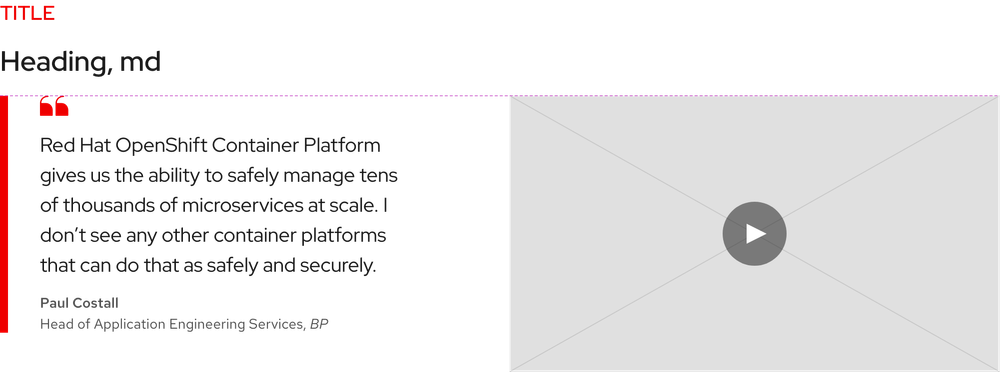
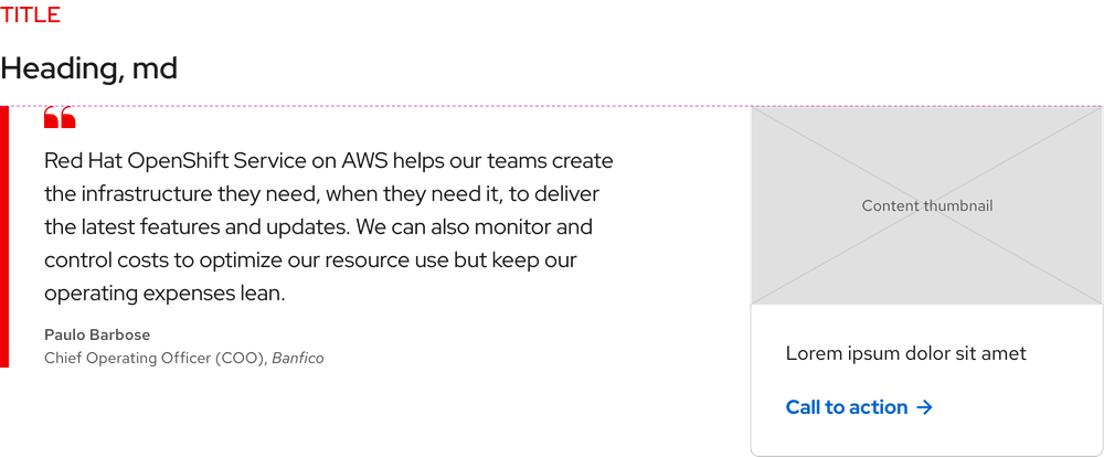
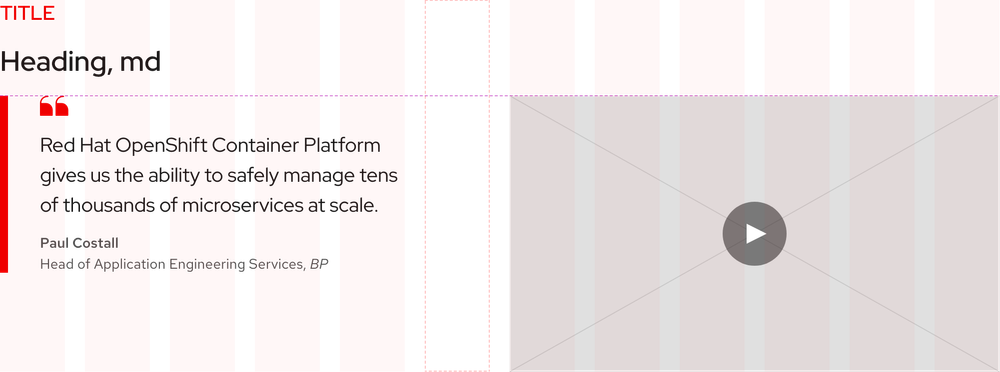
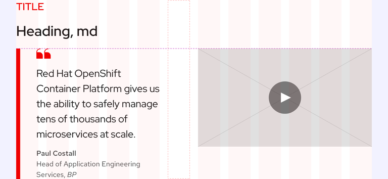
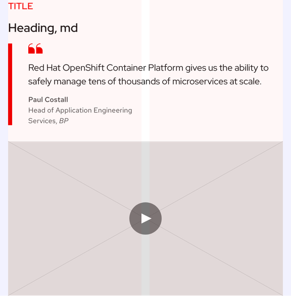
Other elements including a video or card may also be added to a blockquote. They are aligned to the top of the quote icon if included.
Layout
Minimum width
A minimum width is hard to determine because a blockquote can be placed in a variety of layouts. However, a thin blockquote has readability issues, so use your best judgment when considering how wide a blockquote should be. A reasonable minimum width for a blockquote in a page layout is 450px. If a blockquote is used in a card, the minimum width will be smaller.


Maximum width
The maximum width of a blockquote anywhere is 750px to avoid reader fatigue.


Card
A Default size blockquote can be placed in a card if the text is short enough. Otherwise, keep blockquotes with lots of text in the page layout to avoid readability issues. A blockquote will get taller as containers and breakpoints get smaller, so take that into consideration as well.

Other elements
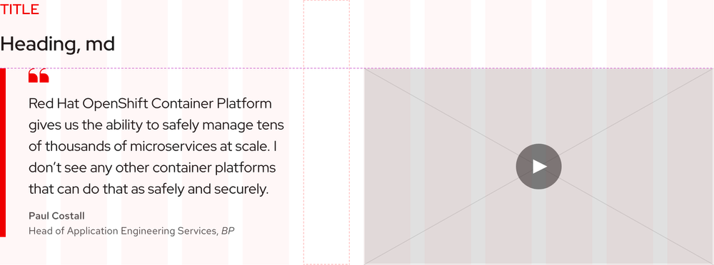
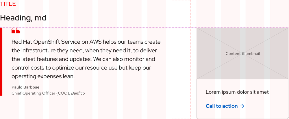
When other elements are used with blockquotes, they are placed on the right. Some elements like a video will cause the width of a blockquote to decrease or increase.
Helpful tip
There is always one column of space in between a blockquote and another element like a video or card.
Responsive design
As breakpoints get smaller, blockquote text sizes will be reduced based on the mobile typography scale.
Default size


Large size



Other elements

Best practices
Missing elements
The quote icon and citation text must always be included.

Readability issues
Blockquotes that are too thin are sometimes hard to read.

Adding an emphasis border
Do not add an emphasis border to a centered blockquote.

Centered blockquotes
Do not place any elements near centered blockquotes.

Related elements or patterns
Feedback
To give feedback about anything on this page, contact us.
Red Hat legal and privacy links
- About Red Hat
- Jobs
- Events
- Locations
- Contact Red Hat
- Red Hat Blog
- Diversity, equity, and inclusion
- Cool Stuff Store
- Red Hat Summit
Red Hat legal and privacy links
