Style
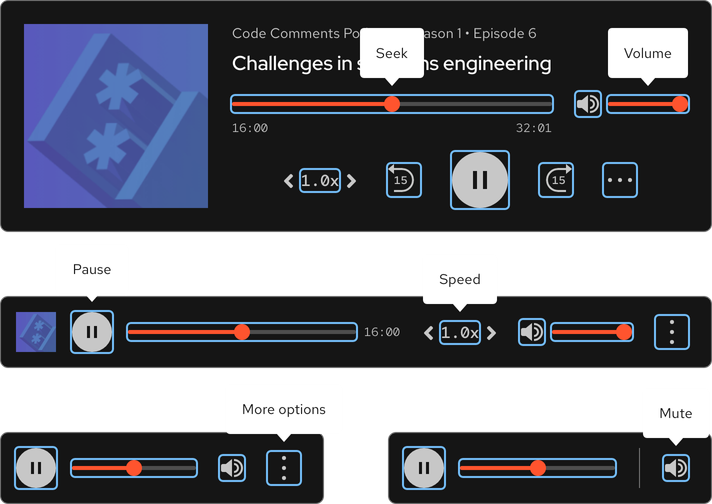
The audio player is a collection of elements used to play audio clips and browse features. There are also optional slots for an image and description text. The audio player must include the following elements at a minimum:
- Audio clip title
- Seek bar and clip times
- Unmute/mute button and volume control
- Playback controls (speed, rewind, play/pause, forward)
- Contextual menu
Anatomy
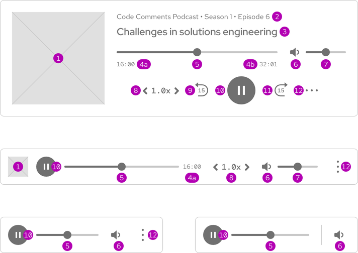
- Image
- Description
- Title a. Elapsed time b. Total time
- Current time/seek bar
- Unmute/mute button
- Volume level
- Playback speed
- Rewind
- Play/pause
- Forward
- Contextual menu
Sizes
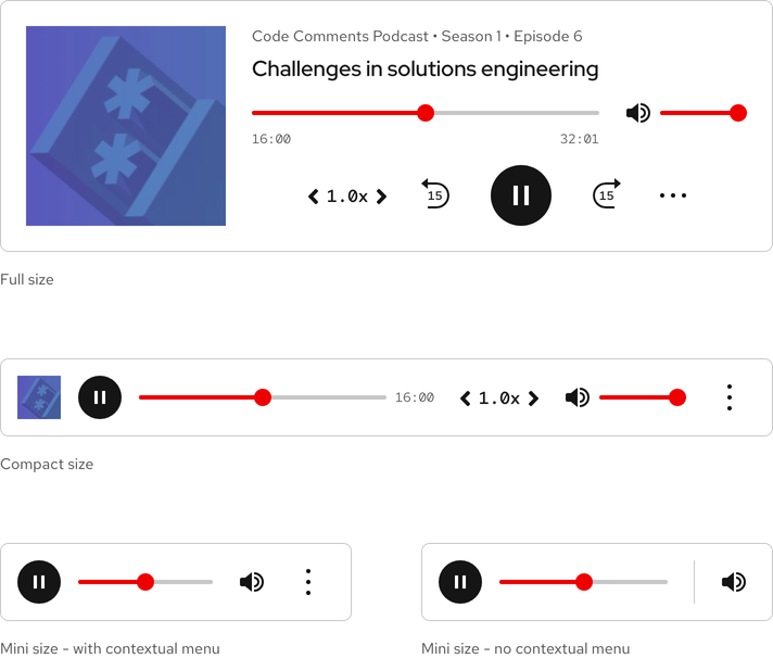
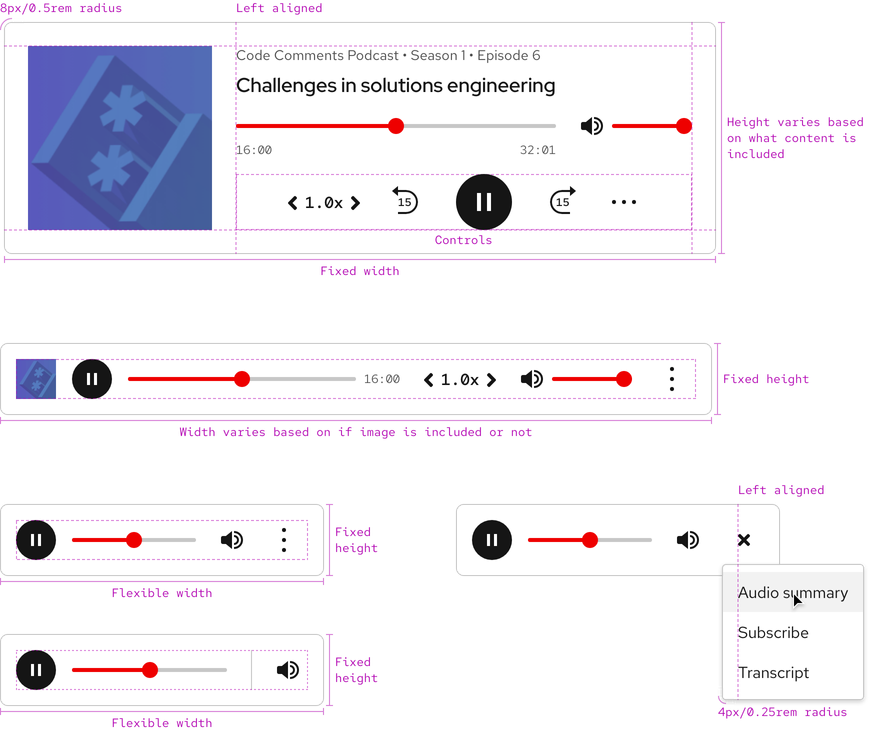
There are three available sizes and the only difference is the amount of interface elements. The Compact and Mini players can be used on large breakpoints, but the Full player cannot be used on small breakpoints due to space constraints.
Theme
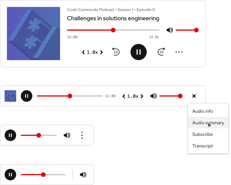
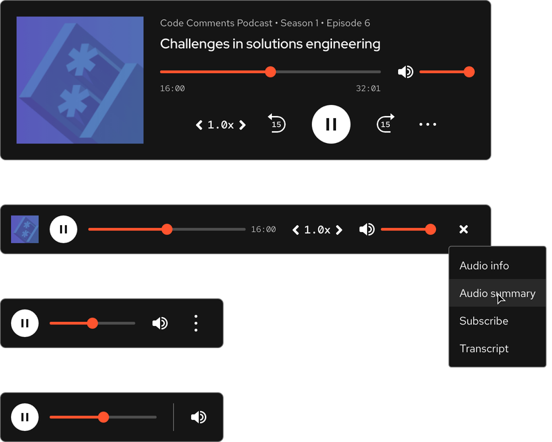
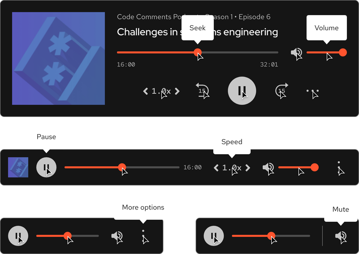
The audio player is available in both light and dark themes.
Light theme
Dark theme
Custom theme
Helpful tip
If your audio player requires a custom theme, contact the design system team.

Configuration
The size of audio players change if an image is included or not.
Space
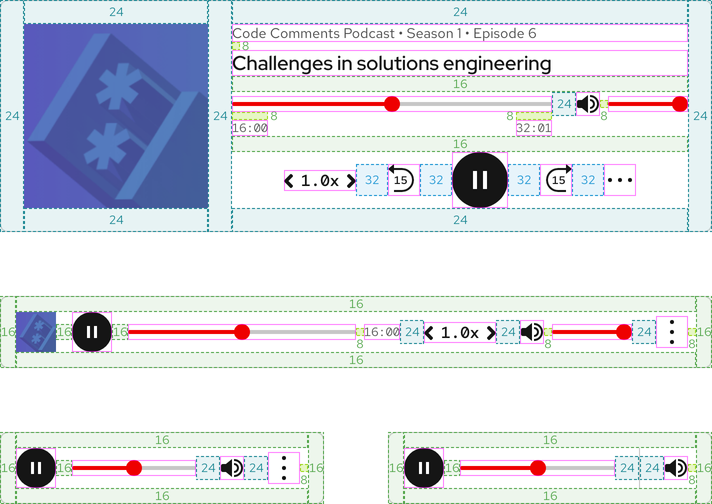
The amount of space in all audio players remains the same on all breakpoints.
| Example | Token | Description |
|---|---|---|
| 8 | --rh-space-md | 8px spacer |
| 16 | --rh-space-lg | 16px spacer |
| 24 | --rh-space-xl | 24px spacer |
| 32 | --rh-space-2xl | 32px spacer |
Interaction states
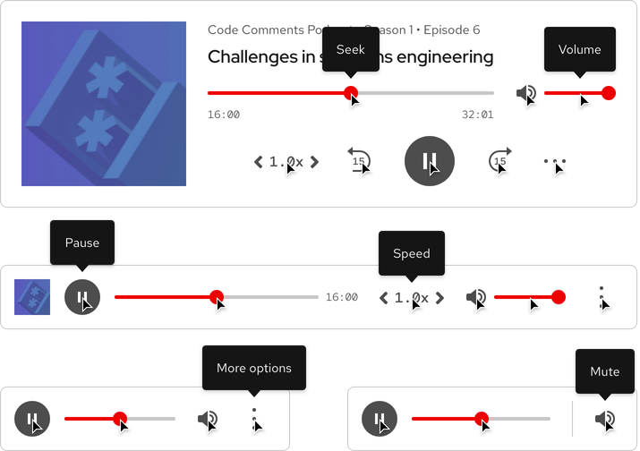
Interaction states are visual representations used to communicate the status of an element or pattern.
Hover
Helpful tip
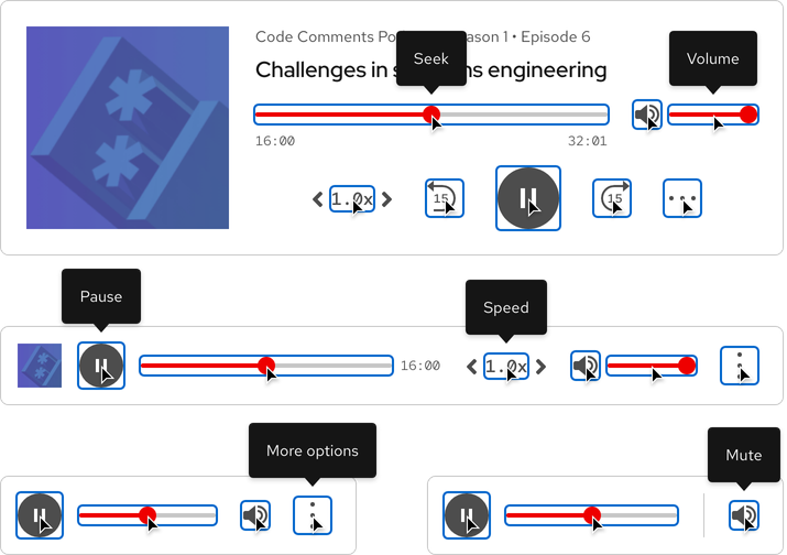
Every interactive element includes a tooltip as part of the Hover state. To learn more, go to the Accessibility page.
Focus
Helpful tip
The Focus state has the same styles as the Hover state.

Active
Helpful tip
The Active state has the same styles as the Hover state.

Related elements or patterns
Feedback
To give feedback about anything on this page, contact us.
Red Hat legal and privacy links
- About Red Hat
- Jobs
- Events
- Locations
- Contact Red Hat
- Red Hat Blog
- Diversity, equity, and inclusion
- Cool Stuff Store
- Red Hat Summit
Red Hat legal and privacy links
