Usage
Use an audio player to allow users to play short-form audio clips or long-form audio files like podcasts.
Features
Playing and controlling audio are not the only functions of the audio player. There are features included where users can read the audio summary, view subscription options, and follow along with or even download the embedded transcript. These features help users listen to audio while staying within the same experience on the same page.
Sizes
When choosing one size over the other, consider where it is being used and what controls should be visible to users. Some audio player sizes have limited controls due to space constraints and some sizes occupy more space in a layout than others. Also take into account how an audio player changes size when users expand certain features.
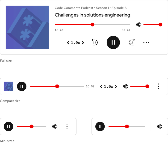
| Size | Use case |
|---|---|
| Full | Use when the audio player is the primary focus and if users need access to all controls |
| Compact | Use when there are other elements nearby and if users need access to some controls |
| Mini | Use on small breakpoints or stretch to fit large breakpoints and if limited controls is acceptable |
Removing elements
It is acceptable to remove optional elements, but doing so will change the height or width of the audio player.
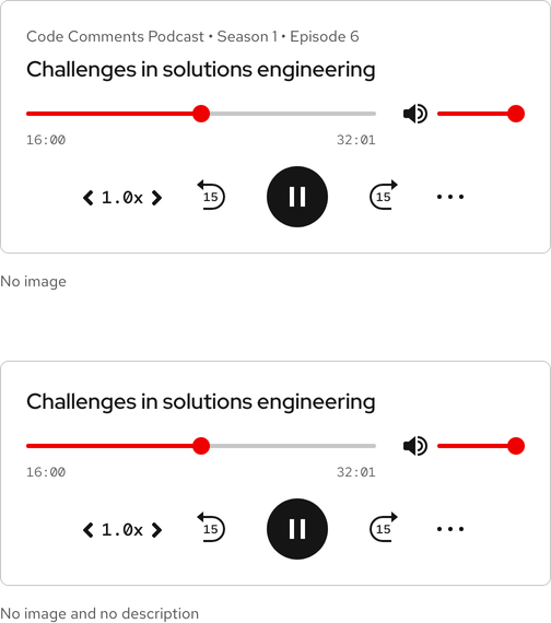
Mini player
In certain edge cases, the Mini player can hide the volume and contextual menu buttons.
Writing content
Description and title
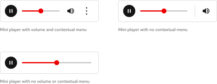
The description and title help add context to an audio clip. The description is optional, but the title is mandatory.
Warning
The description and title are not included in the Mini size players.
Character count
Using too many characters will cause the description and title to scroll outside of the visible area. The recommended maximum character count for the elements of an audio player are listed below and include spaces.
| Element | Character count |
|---|---|
| Description | 80 |
| Title | 40 |
Layout
Inline
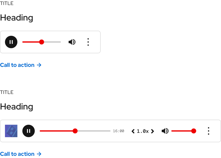
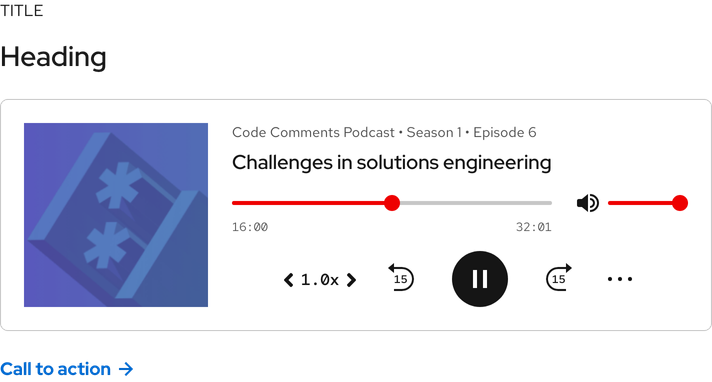
Compact and Mini players can be used inline with titles, headings, and a call to action.
Stacking
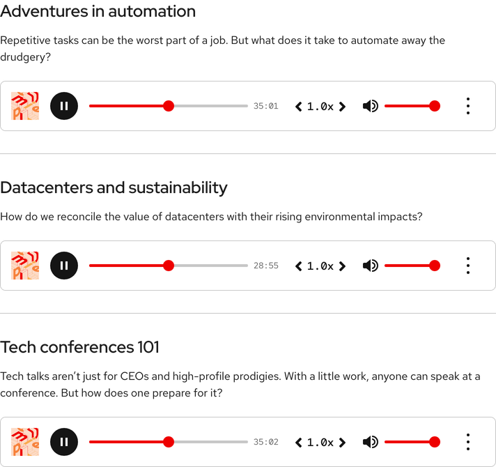
Compact players can be stacked with headings, text, and horizontal rules.
Full-width
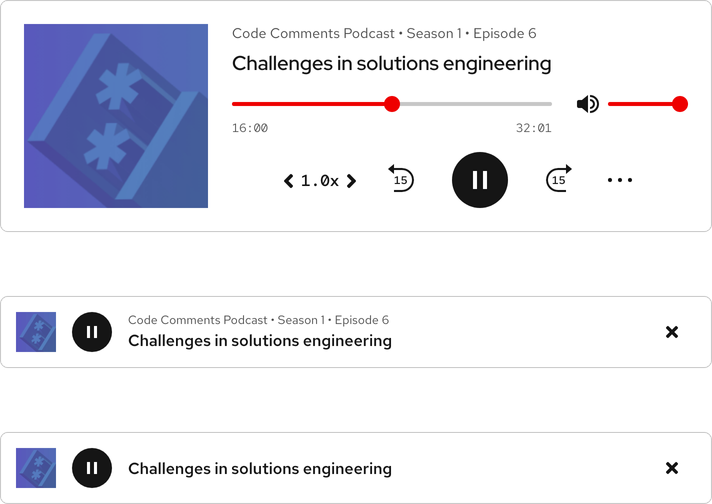
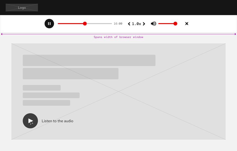
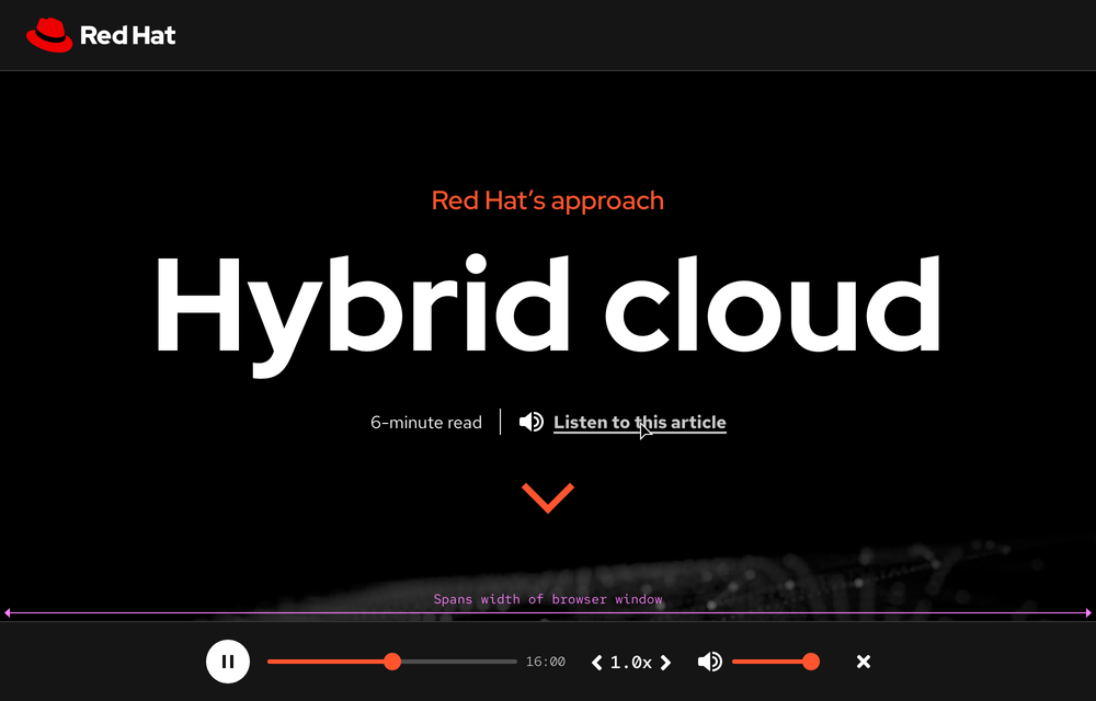
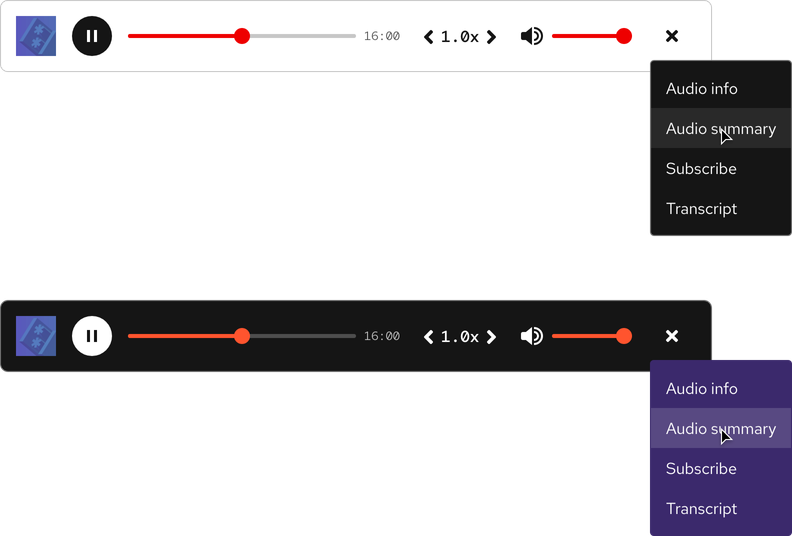
The Compact size can span the width of a browser window and be anchored to the top or bottom of a page.
Warning
When a Compact size is used full-width, the contextual menu button is replaced by a close button and there is no access to features.
Behavior
Autoplay
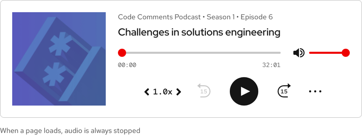
When a page loads, audio should never start playing automatically without receiving input from a user first.
Scrolling text
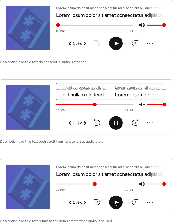
If the description or title is long, it scrolls from left to right while audio is playing.
Playback
To see a list of all keystroke controls, go to the Accessibility page.
Seek
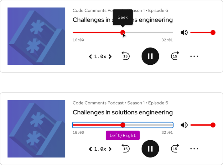
Dragging the current time indicator will jump to a specific time. Arrow keys will rewind or advance audio by 15 seconds.
Unmute/mute
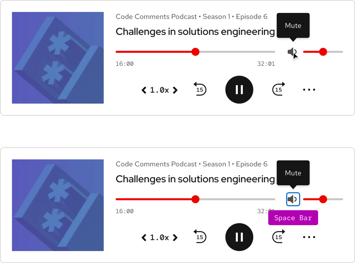
Audio can be toggled on or off by pressing the unmute/mute button.
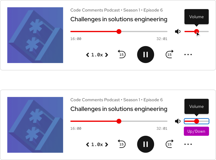
Volume
Dragging the slider will adjust the volume. Arrow keys will increase or decrease the volume by 25% intervals.
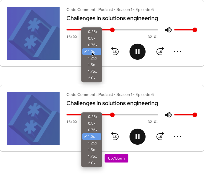
Speed
The rate of speed can be adjusted by clicking the carets or selecting the speed button and choosing a speed in the menu.
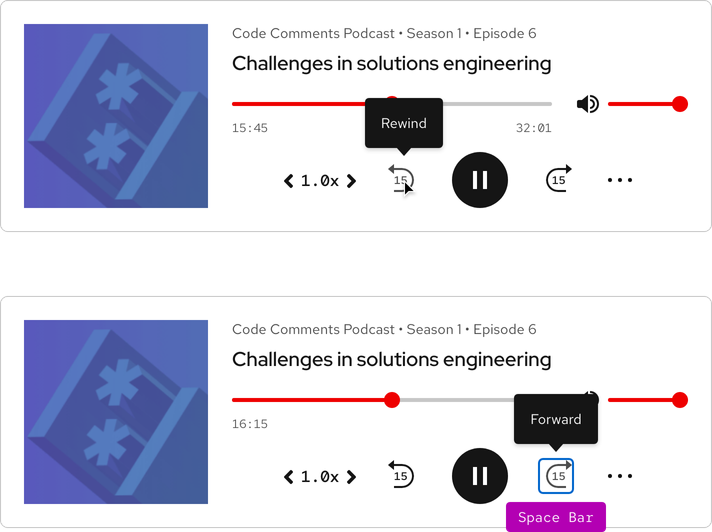
Rewind/forward
Audio rewinds or advances by 15 seconds if either button is pressed.
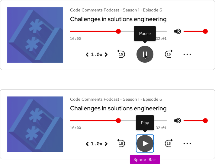
Play/pause
Audio playback can be resumed/stopped by pressing the play/pause button.
Responsive design
Large breakpoints
All audio players can be used on large breakpoints. The Mini player can be stretched to fit any grid or container size.
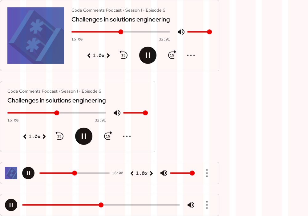
The Full player will change to the Compact player and the Compact player will change to the Mini player as breakpoints get smaller.

Small breakpoints

Best practices
Full player
Be careful when using the Full player near too many other elements.
Contextual menu
Do not alter contextual menu theming.
Related elements or patterns
Feedback
To give feedback about anything on this page, contact us.
Red Hat legal and privacy links
- About Red Hat
- Jobs
- Events
- Locations
- Contact Red Hat
- Red Hat Blog
- Diversity, equity, and inclusion
- Cool Stuff Store
- Red Hat Summit
Red Hat legal and privacy links
