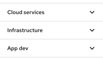
Accordion
Expands or collapses a stacked list of panels
Alert
Notifies a user without blocking their workflow
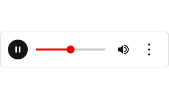
Audio player
Plays audio clips and includes other features
Avatar
Visually represents a user in a masthead or navigation
Badge
Annotates information like a label or object
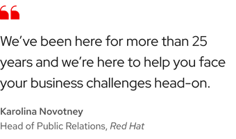
Blockquote
Highlights quotations and citations with text styles
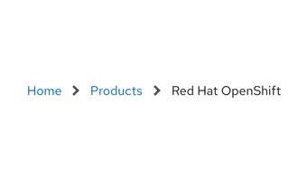
Breadcrumb (coming soon)
Keeps track of location as users move through pages
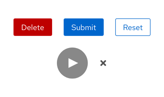
Triggers actions on the page or in the background
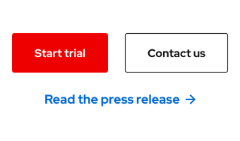
Call to action
Directs users to other pages or displays extra content
Card
Arranges content and interactive elements in a layout
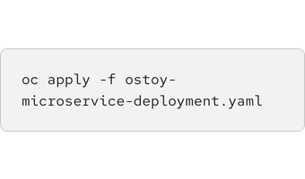
Code block
Formats code strings within a container
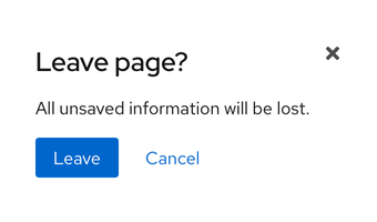
Dialog
Communicates information requiring user input or action
Displays secondary information at the bottom of a page
Provides additional information or a source for content
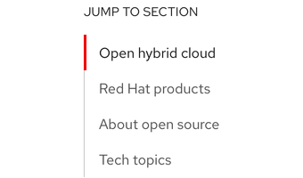
Jump links
Moves users to specific content when a link is selected
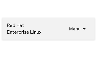
Navigation (primary)
Organizes content representing global web properties
Navigation (secondary)
Propagates related content across a series of pages
Allows users to navigate content divided into pages
Popover
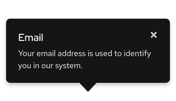
Overlays an area of information without blocking users
Progress steps
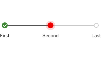
Guides users through a task with sequential steps
Spinner
Notifies users their action is being processed or loaded
Statistic
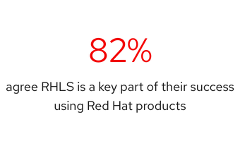
Showcases a data point or quick fact visually
Subnavigation
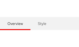
Organizes content into sections using tabbed pages
Table
Organizes and displays information from a data set
Tabs
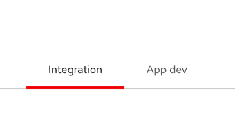
Arranges content in a contained view on the same page
Tag
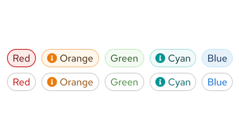
Highlights an element to add clarity or draw attention
Tile
Creates a clickable, contained surface
Timestamp
Displays a line of text with date and time values
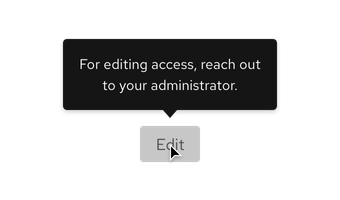
Reveals a small area of information on hover
